According to Statista, the average email marketing return on investment (ROI) across industries is $36. It’s no wonder, then, that 82% of marketers use emails for their marketing.
The flip side: Customers receive an overwhelming number of marketing emails each day.
Just look to your personal inbox for proof, or the fact that many people have 3 email accounts: one for work, one for personal, and a “disposable” one they use when they know someone will email them a lot, and they don’t want to deal with the volume.
Still, the average email open rate today is 58.61%, which is pretty good when emailing your list. Those numbers go up when you segment your lists and email more relevant messages to your audience, regularly clean your list, and make your unsubscribe options clear and easy to use.
The ability to directly talk to and engage with more than 30% of your audience is one of the biggest benefits to email marketing.
The ability to directly talk to and engage with more than 30% of your audience is one of the biggest benefits of email marketing.
Here’s how an average email marketing funnel works—all stats were pulled from Klaviyo’s email marketing benchmarks by industry report from 2022.
- A brand uses paid advertising to drive potential customers to their site, then collects an email address.
- From there, the brand sends welcome emails—which have a 55.61% average open rate—to introduce the potential customer to the brand, why they exist, what they believe in, and what they sell.
- Over time, as that potential customer browses products or adds them to their cart, a company sends browse abandonment or cart abandonment emails—with 55.33% and 49.89% average open rates, respectively—to stay front and centre in the potential customer’s mind and inbox.
- Once a purchase finally happens, a brand needs to keep the new customer updated on where their package is and when it will arrive.
- Then, the brand sends out post-purchase emails to gather reviews or try to win more business from that customer—growing the customer’s lifetime value (CLV). These emails have a 61.05% average open rate.
- Later, the brand may send loyalty program emails or re-engagement emails based on how that customer interacts with the brand over time, working to keep them engaged or cleaning them off your list, if it comes to that.
None of this is possible without email—and none of it is possible without strong email design.
Every email you send—from a basic HTML email that looks like something sent from a friend or colleague, to one that is heavily designed and looks more like a magazine or high-quality print piece—needs to be based on some kind of design thinking.
The good news is that you don’t need advanced graphic design or coding skills to design great emails—though many organisations, especially as they grow, do hire graphic designers and freelancers specifically for email design.
To tweak an email template to suit your needs, you’ll want to understand the basic components of an effective marketing email.
Whether you hire email marketing experts or not, excellent marketing email templates are readily available on the web. Many of them even live in easy-to-use design tools like Canva. Or, Klaviyo has a large library of email templates ready to use, with drag-and-drop features, so you can customise them however you like.
To tweak an email template to suit your needs, though, you’ll want to understand the basic components of an effective marketing email.
So, let’s go over the elements of an excellent marketing email, the email design best practices that govern it, and examples of emails that convert.
Table of contents:
- How to improve email open rates
- What is good email design?
- The 3 main types of emails and email templates
- The 7 components of an effective email design––and email template
- Email design best practices even experts often forget
- The latest email design trends
- How and where these emails fit into your customer lifecycle and buyer journey
- Final thoughts: email design principles that last
How to improve email open rates
Unless someone on your email list opens your email, they aren’t going to see any of the work you put into the design. And, there’s only one way to get your customer to open your email in the first place: Make it relevant for them.
No one wants to waste time reading emails that don’t offer value. You need to send the right email to the right people.
No one wants to waste time reading emails that don’t offer value. You need to send the right email to the right people.
And to send emails to the right people, and improve your email open rate, you first need to:
- Segment your email lists
- Personalise your emails
- Create a compelling subject line and preheader text.
Once subscribers or customers open an email, you’ll be ready to engage them and persuade them to click the call-to-action (CTA) button or prompt.
An excellent email design improves the odds of getting that click. It’s just one of the many things that can make or break your conversion chances.
What is good email template design?
Email design is the process of putting together a marketing email by assembling its components based on the goal of that email, and the target audience.
Sometimes email designs use graphics, gifs, videos, pictures, and more. Other times, an email design is simple and text-based only. Either of these email designs can work incredibly well depending on the brand, the audience, and more.
Some teams start with pre-made email templates available on the internet from freelancers, Canva, or in email template libraries like Klaviyo’s.
Once a company builds email designs they like and use often, they then turn those email designs into templates. Some teams start with pre-made email templates available on the internet from freelancers, Canva, or in email template libraries like Klaviyo’s.
When designing an email, ecommerce marketing teams often rely on a brand’s style guides to direct the colour scheme, information hierarchy, and overall email layout. You also need to choose the email background, images, text placement, and interactive elements, as well as make sure that whatever you design works well from an accessibility point of view, including ensuring that the email source code is clean.
Email design brings all of these elements together to create a high-converting marketing email.
Why is email design important?
Nearly every brand out there is using email marketing to communicate with subscribers and customers and increase sales. High-quality email design helps your brand stand out in a crowded inbox, but that’s not all.
Even if a recipient opens your email, they may only spend a few seconds reading it. A good email design helps you convey your message quickly. It also holds the reader’s attention and entices them to click on the CTA.
Even if a recipient opens your email, they may only spend a few seconds reading it. A good email design helps you convey your message quickly.
And it isn’t just about immediate sales, either. High-quality and well-branded email marketing design can build customer loyalty, help your subscribers and your customers better understand what your brand is about, push them more toward additional purchases, or encourage them to recommend you to their friends or family.
Every email is a chance to further your relationship with a subscriber or a customer, and your email design is an important, quick, and visual part of what you are trying to say, just as much as what you do say in the email itself.
3 main types of emails and email templates
For many brands, email is the main channel of customer communication for:
- Announcing new products
- Sharing important or relevant industry news
- Sending offers and discounts, especially to highly engaged segments
- Sharing a nice seasonal greeting based on your audience and what times of year are important for them
- Sending cart reminders to keep products someone liked top of mind
- Sending more information about who the brand is
- Promoting customer loyalty programs
- Updating customers about their orders
These emails then come in the form of campaigns—which are one-off sends like new product announcements—or automations—sometimes known as flows, these are emails triggered by an action someone takes on your site.
All of these emails often have different goals, and it’s best to have a different email template for each type, too.
1. Product-based emails and email template types
Product-based emails are often promotional in nature, but not always. They are usually campaigns—like new product announcements or seasonal discounts or offers—but can also be automations like browse abandonment emails or cart abandonment emails.
You can even include products in your welcome emails if you want.
You can even include products in your welcome emails if you want. The strategy and tactics you use to educate your email list and convert them is all yours, after all.
There are two main types of product-based emails.
Email designs featuring a single product
Let’s say you just released a stellar product and want to share it with your customers through an email campaign. A hero email template or snack template goes well with this email.
You may also use this template to inform your customers when a product is back in stock.
You may also use this template to inform your customers when a product is back in stock.
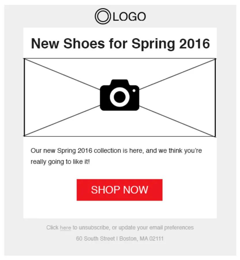
The hero template is highly streamlined and usually contains the following elements:
- Heading
- Hero image
- A short blurb
- CTA button
Our hero template looks like this:
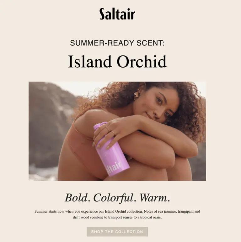
Saltair’s summer-ready scent email is a great example of the hero template:
Emails featuring a seasonal collection or a product group
If you want to inform subscribers and customers about a group of products, the image gallery template works best. This email template is also good for showcasing seasonal collections.
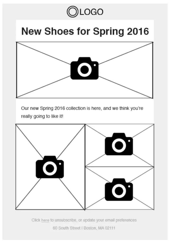
This template usually features a hero product and 3-6 related products, and is a bit more editorial in style. The main elements of the image gallery email template include:
- Headline
- Hero image
- Tagline
- 3-6 images
- An optional CTA
Here’s our image gallery template:
See how Juniper uses an image gallery template to showcase different item in an artist’s collection.
2. Blog post round-up email design
Many brands like to send regular email newsletters that feature their weekly or monthly blogs. Blogging has become a more important strategy for ecommerce brands as they work to increase their organic search rankings and better balance their businesses between paid and organic traffic and customer acquisition.
The blogs a brand publishes are often about topics they care about or ones related to how the product is produced. These can be incredibly helpful posts for your audience—subscribers or customers—in showing them your brand’s dedication to a cause and the supply chain.
The blogs a brand publishes are often about topics they care about or ones related to how the product is produced.
But not everyone is going to naturally find this content, so one great way to distribute it is to send a regular email newsletter.
One of the most popular email newsletter templates is a storyboard template, which gives you the ability to round up all the recent blogs into one email.
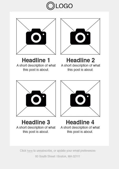
A storyboard email might contain the following elements:
- Hero image
- Headline
- Description
- An even number of images fit into a grid
This is our storyboard email template:
Here is Sandland’s branded take on the storyboard template:
3. Informational email designs and templates about processes, changes, etc.
You can use an email newsletter to inform customers about changes in your policies or processes. These emails are informational and help your customers understand what’s going on. They also walk customers through any actions they need to take.
You can use these emails to announce updates, of course, but these are already great to include in automations—especially in a welcome series—where customers are learning more about who your brand is, and how things work.
A checklist template works best for these emails, which usually contain the following elements:
- Headline
- List of icons
- Corresponding subheadings + descriptions
This is how our checklist template looks:
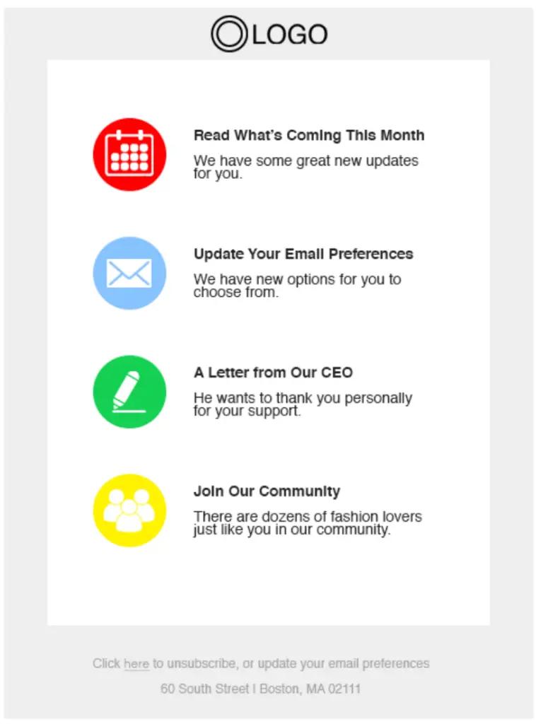
Here is an example of this email template in use—and customised—from Bearaby as they promote a series of talks for Mental Health Awareness month.
4 components of an effective email template
Many design elements come together to make an awesome marketing email. The key is using these elements with great attention to detail to achieve a successful email marketing campaign.
Here are the essential components of an effective marketing email.
1. The email header components
The email header is the top portion of an email. While they may vary slightly based on templates, headers typically include:
- Preheader text
- Professional logo
- Navigation bar
- Social media links
Preheader text
The preheader text is a brief sentence that conveys the essence of your email.
Its text appears in an email’s inbox preview and helps evoke the reader’s interest to open your email, to begin with. This is a great part of an email to A/B test to understand the impact it has on the open rate.

Remember that the preheader text will also appear inside your email. Make sure it doesn’t distract readers from the email itself.
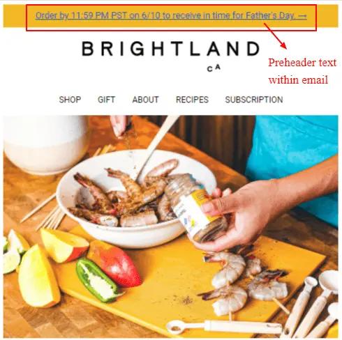
It’s better to make the preheader text unnoticeable inside the email body. Here are two ways to achieve that:
- Make the preheader text much smaller than your paragraph font.
- Make the font a few shades lighter than your paragraph font.
You may also hide the preheader text by making it the same colour as the email background.
Professional logo
Your logo is the cornerstone of your branding, and it should appear prominently in your emails. Most brands place the logo in the header. Make sure you use a professionally designed, high-resolution logo.
Using your logo consistently across email marketing campaigns helps you reinforce your brand identity.
Resize the logo if it looks distorted when placed in the header. The placement of the logo should match your website. If your logo appears at the centre of your website, centre-align it in the email as well.
Using your logo consistently across email marketing campaigns helps you reinforce your brand identity.
Navigation bar
The navigation bar is a great way to pack multiple links into your email. You can also include different links based on the type of email, such as:
- Homepage
- Products page
- Shopping cart
- Sales page
Keep the navigation bar clutter-free. We suggest including no more than 4 links in your navigation bar.
2. The visuals in your email design
Visual elements play a significant role in engaging customers. You can use different types of visuals in your marketing emails, including:
- Photos
- Illustrations
- Mixed media
- Infographics
Although images are great for capturing your recipient’s attention, remember to strike a balance between text and images.
“I still see lots of brands sending image-only emails, and these can be slow to load or show nothing but the unsubscribe link when the user is out and about and coverage might be poor,” explains Hannah Spicer, director, Hannah Spicer Consulting. “Always include some text in your email.”
I still see lots of brands sending image-only emails, and these can be slow to load or show nothing but the unsubscribe link when the user is out and about and coverage might be poor.Hannah Spicer, director, Hannah Spicer Consulting
You can optimise images, especially for mobile devices, to avoid long loading times.
Also, don’t forget to include alt text for all the images. Even if an image doesn’t load, alt text will give the recipient an idea of what the image is about.
3. The email background—often forgotten, but very important
The email background could be an image or a pattern that makes the backdrop of your email. A carefully chosen email background helps you convey the personality of your brand.
Patterns as background
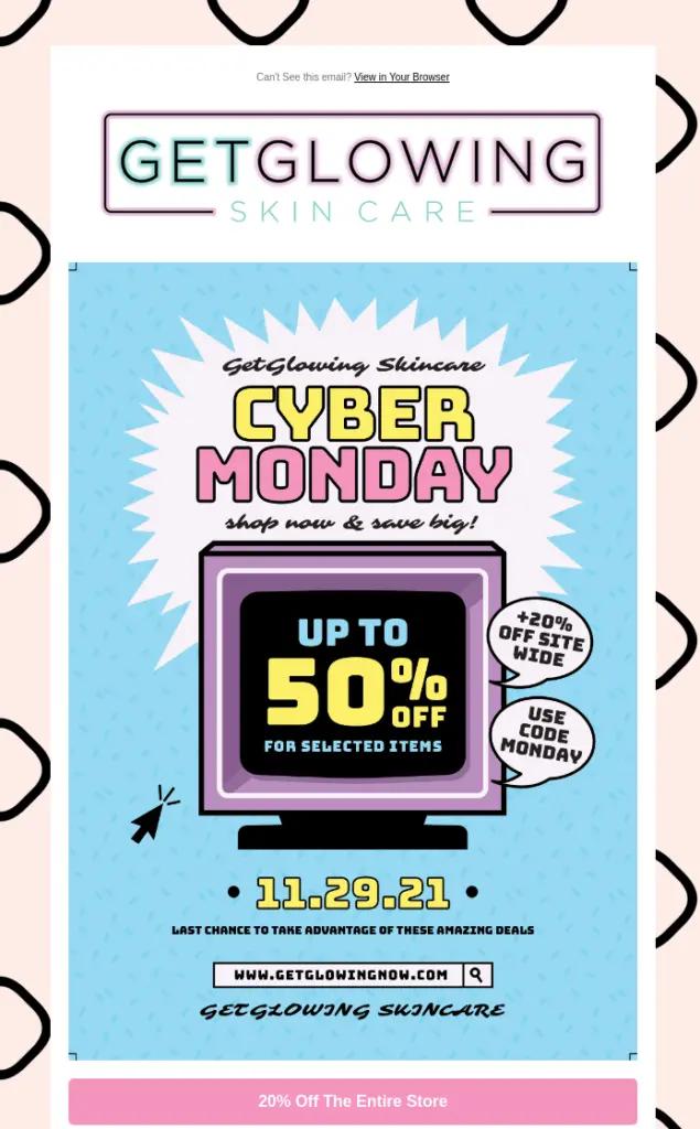
A repeating pattern makes a good choice for an email background. Patterns make the emails pop, and it’s more interesting than a plain background.
The pattern could be subtle or bold based on your brand’s personality.
- If your website has a neutral colour and minimalistic design, go for subtle patterns.
- If you use bold colours and visuals on your website, choose bold patterns.
Check out the bold pattern Get Glowing uses as an email background.
Images as background
You may also use photographs or illustrations as your email background. Just be careful when using images—the background image shouldn’t take attention away from the email content. Likewise, the email content shouldn’t obscure the background image.
The background image should be related to the email content in some way. And when using email backgrounds, always make sure your email content is legible.
4. Email footer
An email footer is the portion that appears at the bottom of your marketing email. Think of it like an endnote to your email. Businesses often place a few elements in the email footer, such as:
- Unsubscribe link
- Link to change email preferences
- Social links
- Business address
Email footers also help you comply with GDPR, which mandates that the email sender include their contact information and a way to opt out.
That said, you can still get creative with your email footer.
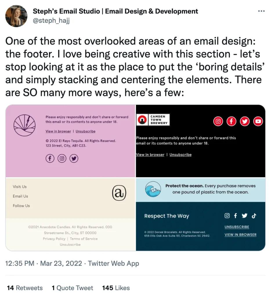
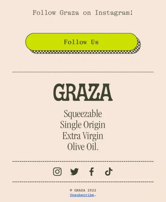
Social media links
The email footer is an excellent area to place your social links, too. Several brands even include photos from their social feeds, like Instagram, in the footer, too, to encourage people to engage on those platforms and showcase their community.
Here is a great example from Graza.
Email design best practices even experts often forget
Paying attention to email design elements helps you create stunning emails. But you also need to follow email design best practices to get the best out of your efforts.
Keep these pointers in mind to maintain the quality of your emails.
Reduce cognitive load— simplify your email CTAs
According to Marketing Charts, people only spend 10 seconds on average on a brand email—which means you have about 10 seconds to make an impression.
Don’t have more than three calls to action in your email.Alexa Engelhart, vice president, client strategy at Power Digital
In order to make sure your emails are easy to scan and understand, try these tips for reducing the cognitive load of your emails:
- Don’t include too many offers or CTAs.
- Keep the offers relevant.
- Use a clutter-free email layout.
- Avoid including a lot of information or images.
“Don’t have more than three calls to action in your email,” suggests Alexa Engelhart, vice president, client strategy at Power Digital. “Not only does this tend to make the email very long (and therefore, harder to digest), it also increases the likelihood of users actually not clicking anything at all.”
Use a mobile-first email design
A case study by SuperOffice showed that 81% of all emails are opened on mobile devices. That means adopting a mobile-first email design and ensuring emails are responsive is a must.
“Make sure the design is mobile-compatible,” says Adam Kitchen, CEO, Magnet Monster. “It’s simple advice, but so many emails are still designed exclusively for desktop, when the majority of users now consume the content on mobile.”
So many emails are still designed exclusively for desktop, when the majority of users now consume the content on mobile.Adam Kitchen, CEO, Magnet Monster
Responsive emails fit perfectly into any screen size. You also need to optimise the length of your subject line and preheader text to fit the mobile inbox. Likewise, you should optimise your images for mobile.
A one-column layout works great—i.e. better—for mobile devices.
Personalise your emails
Ecommerce personalisation—including email personalisation—often gets a bad rep. Many marketers, and likely their bosses, assume that personalisation means you tailor your email content, for instance, for every single customer or subscriber.
That is far too much—and not scalable.
Instead, email personalisation should be based on email segmentation. This means that a strong email segmentation strategy is the foundation for your email personalisation—and your SMS personalisation, too.
Email personalisation should be based on email segmentation.
Segment your subscribers and customers based on:
- The products they have purchased before
- Where they are in your funnel in general (brand new, only browsing, have purchased several times before)
- Geographical regions
- Niche, zero-party information they’ve shared in quizzes
Those are only a few ways you can segment your audience. But in each of these instances, because you are creating a unique message for that specific segment, the content is already highly personalised in a one-to-many way, versus one-to-one.
Then, you can add on these additional personalisation tools—which ESP tools like Klaviyo allow you to automate—to make the email experience feel like a one-to-one personalised message when it is not.
- Address your customer by their first name.
- Suggest products that match the customer’s previously browsed products, or related products to those previously browsed items.
- Communicate at a time the customer is most active—likely depending on their time zone.
- Acknowledge their birthday, their anniversary of their first purchase with your brand, and major holidays in the customer’s region.
You need to collect customers’ data to personalise your emails efficiently. Instead of relying on third-party marketing data, try to collect Customer-First DataTM directly from your customers.
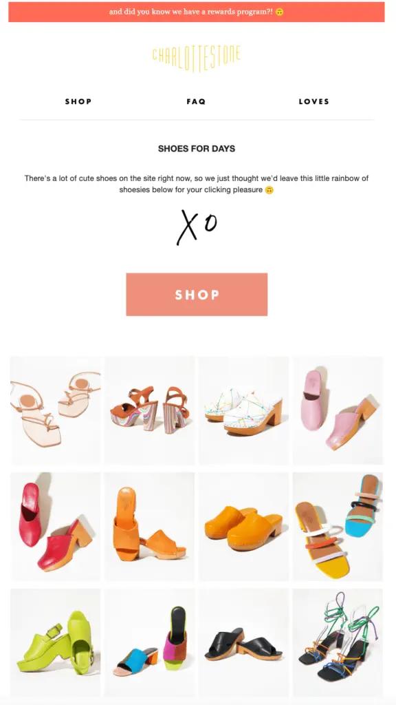
Charlotte Stone does email design personalisation incredibly well. Below is an example of an email they sent to a Klaviyo employee. All the shoes featured in this email are ones this employee browsed earlier in the week.
Convey your brand’s personality
Every business has a unique personality. The better you project your brand’s personality, the more brand recognition you will build among your base of customers and prospects.
You can use multiple techniques to express your brand’s personality in marketing emails, including:
- Striking visuals
- Your brand’s colours and unique colour palette
- Tone of the email copy
- Animations
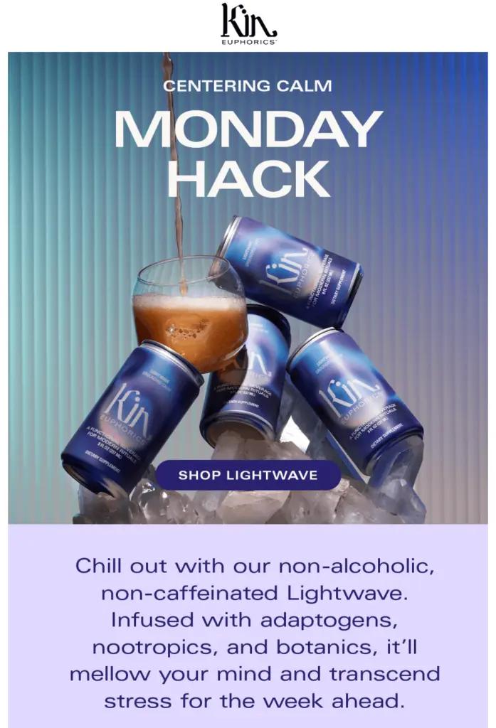
Kin Euphorics has a recognisable brand, with a throwback 1970s colour palette. For their two main products, they use a brighter colour for the “pick-me-up” drink and a darker, blue tone for the “chill out” option.
Add an unsubscribe link
You should always provide your customers with an option to unsubscribe from your emails.
Regulations like CAN-SPAM mandate that businesses provide their customers with a way to opt out of their marketing emails, but even without mandates like that, it is just a best practice to let folks get off your list if they want off. It saves you time in cleaning the list, anyway.
It is a best practice to let folks get off your list if they want off. It saves you time in cleaning the list, anyway.
Plus, if the email doesn’t have the option to unsubscribe, the recipient might mark it as spam, which could have consequences for your email deliverability.
It’s best to place the unsubscribe link in the footer. Many consumers have grown to expect unsubscribe links in the footer, so make sure yours is there—and visible.
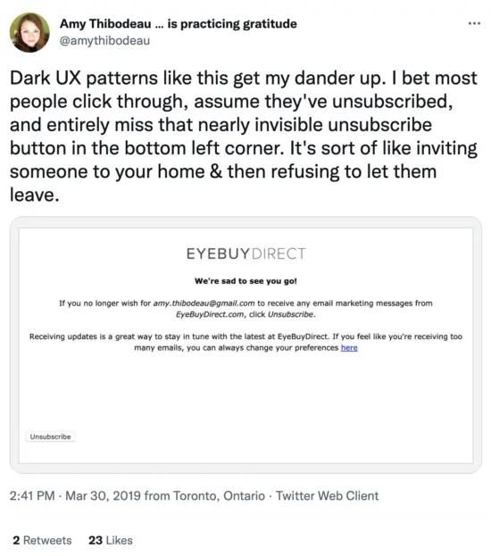
Some brands add an unsubscribe link in the email header, too, to make it easier for customers and subscribers to unsubscribe.
A/B test your emails
Designing good emails alone isn’t sufficient. You also need to test if they work. A slight change in one of your email design elements may translate to a significant change in performance.
Consider A/B testing your emails by:
- Adding or removing the navigation bar
- Changing fonts
- Adding or removing product blocks
- Varying colours
It’s best to test only one variable at a time to get precise results. Also, don’t go overboard with the variations you test.
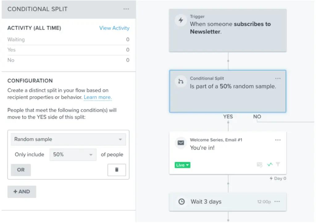
After sending out each variation, you can track email performance metrics like open and click-through rates to determine which design works better. Klaviyo offers conditional splits in email flows to help you A/B test your emails more effectively.
Preview how your email looks in different inboxes
This is such an important and often overlooked step in email design.
Tools like Klaviyo, and really any good ESP, make it easy for you to see how your email will look on mobile versus desktop or tablet, as well as how it will appear in different inboxes. Yes, email designs will look slightly different in Gmail versus Outlook and more.
Klaviyo even allows you to select a specific person from your email list to view the email the way they would see it.
Many brands also use tools like Litmus to do even more in-depth testing on their new email designs or email templates before making them the mainstays of their email marketing program.
The latest email design trends
Marketing email design is an ever-evolving area, and you need to stay up to date with the current trends.
Following these new trends will help make your emails stylish and add some extra oomph. Here are some email design trends worth exploring:
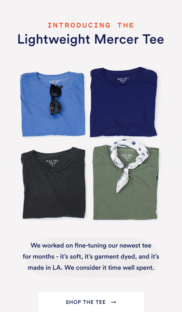
Bring your email to life with animated GIFs
You can make your emails dynamic and grab readers’ attention by including “video” in email content with animated GIFs. Businesses make clever use of animated GIFs to:
- Create dynamic CTA buttons.
- Showcase the product variations.
- Demonstrate how things work.
Animated GIFs are great, but you need to use them carefully. An email cluttered with GIFs will be slow to load, which might annoy the recipient.
Engage recipients with interactive elements
Interactive email designs create an immersive experience for your recipients. Try experimenting with adding different interactive elements to your marketing emails, including:
- Product switcher
- CSS animations
- Polls and quizzes
- Fun scrollable experiences
Interactive features help reduce the monotony of marketing emails. They also allow you to make your products tangible, creating an in-store-like experience.
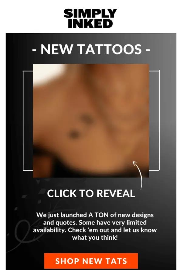
Check out how Simply Inked email engages the customer with an interactive element:
Mixed media
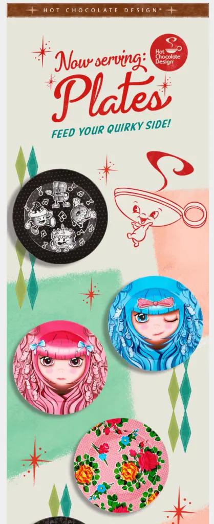
Mixed media is a combination of images, illustrations, and GIFs. It helps you create a fun and engaging email design. By combining photos and graphics, you can elevate standard stock images to another level.
Mixed media is particularly great for businesses that can’t afford custom images/photoshoots. It also helps you add personality to your emails and engage recipients.
Hot Chocolate Design uses a fun mixed media element in their email:
F-pattern email layout
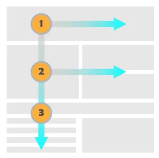
Arranging your marketing email with two horizontal segments and one vertical segment, also known as the F-pattern layout, could help make your emails easier to digest. An eye-tracking study by the Nielsen Norman Group found that people scan pages in an F-pattern.
An eye-tracking study by the Nielsen Norman Group found that people scan pages in an F-pattern.
The F-pattern layout works for emails too. This pattern makes it easy for your recipients to scan the email and quickly grasp its essence.
How and where these emails fit into your customer lifecycle and buyer journey
A smart customer lifecycle marketing strategy includes automating emails to reach out to customers at different stages of their relationship with your brand.
For instance, here are the 9 most popular and highest-converting email automation more than 100K Klaviyo customers use:
- Welcome emails
- Browse abandonment emails
- Abandoned cart emails
- Post-purchase emails
- Winback emails
- Replenishment emails
- First purchase anniversary emails
- Sunset emails
You can enhance these emails with a great design to improve user experience and establish brand identity.
Just keep in mind that no matter the email template or lifecycle stage, emails need to have a clear goal and should not be overly cluttered.
When it comes to design, most emails perform well when there are fewer design elements, to focus subscribers on one key goal for each email.Ryan O’Connor, director of growth, SmartBug Media
“When it comes to design, most emails perform well when there are fewer design elements, to focus subscribers on one key goal for each email,” says Ryan O’Connor, director of growth, SmartBug Media. “This doesn’t mean stores need to sacrifice quality design, just reduce the length of emails and templates to see higher click-through rates.”
Whether you are communicating new products in a campaign, sending your welcome series, or updating customers about your supply chain with an email from your CEO, every email should have a clear purpose, be true to your brand values, and help to build a stronger relationship with the customer either from an information point of view, or getting them close to conversion.
Final thoughts: email design principles that last
Email marketing is one of the most effective marketing strategies and tactics, but the competition is fierce. Great email design can help you stand out and build stronger customer relationships and customer loyalty over time.
Each component of your email requires design thinking and principles, including:
- Header
- Footer
- Email and content background
- Colour scheme
- Typography
And, following email marketing best practices will improve your email open and click rates—all of which leads to more revenue per recipient. To ensure the best possible results and user experience, your emails should have:
- Low cognitive load
- Mobile-first design
- Unsubscribe options
- Personalised content
Klaviyo has pre-built email templates to help jumpstart your design efforts.
Check them outEmail design FAQs
How to design an email?
There are several best practices for designing email for your outreach campaign:
1. Write a strong subject line
2. Make sure the newsletter design is on-brand
3. Use eye-catching background
4. Enhance the readability of email messages for the visually impaired
5. Include a CTA
6. Test using emojis
7. A/B test different design templates
What is a responsive email design?
A responsive design always renders correctly on all devices. In other words, a responsive template displays content as intended on all screen sizes.
What is an email template design?
An email template is an HTML file that contains content substitutes (e.g., content, links, CTA, user-specific information, etc.). A good email template enables you to easily copy and reuse its contents for an email marketing campaign.


