Ezra Firestone started his first business in 2005, before the iPhone was invented and before anyone could advertise on social media.
And in the last two decades of doing business, one fact hasn’t changed for him: Email generates a ton of revenue.
I’ve been doing the same thing since 2005, and I did $70M [in revenue] last year—so the fundamentals still work.
“Everyone is going to tell you everything is changing. You’re in trouble. Advertising has changed,” Firestone says. “But I’ve been doing the same thing since 2005, and I did $70M [in revenue] last year—so the fundamentals still work.”
Of course, Firestone’s owned marketing strategies have become much more sophisticated since he sent his first marketing email—and it shows. Email and SMS account for 40% of his sales, spread across several businesses like oVertone, Boom! by Cindy Joseph, Smart Marketer, and Naväge.
Firestone shared exactly what he does to grow his owned marketing audience, keep them engaged, and sell effectively during a free Klaviyo event, A proven framework to maximize your email & SMS revenue.
We wish we could share every valuable marketing automation tip from Firestone’s talk, but to keep things digestible, we’ve highlighted five of the most inspirational pieces of advice.
1. Test a mystery discount for your website pop-up
20 years after starting in ecommerce, Firestone is still obsessed with optimizing every single part of his business. To this day, he comes up with tests that teach him novel ways to build an audience.
For a while, Boom! was running a standard website pop-up with a 10% discount in exchange for an email. It was working fine, but Firestone wanted to see if he could make it better. Out of curiosity, he wondered what would happen if he replaced the 10% language with, “Sign up now to unlock your mystery discount!”
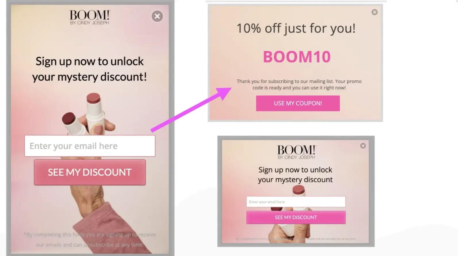
“Guess what?” Firestone says. “It’s still the same 10% off in the end, but up front we say, hey, it’s a mystery. Because people are more intrigued by a mystery, we got 22% more people signing up for the same opt-in just by changing the language.”
Mini-tip: Don’t commit to language changes for your website pop-ups without A/B testing them first. Klaviyo AI will even test multiple versions of your form to find the highest-converting display time, then automatically set the winning form live.
2. Use a multi-step form to collect phone numbers for SMS
Firestone extended his mystery pop-up success with a page-specific exit pop-up for his haircare brand, oVertone. Except this time, he added a step to collect a phone number for SMS.
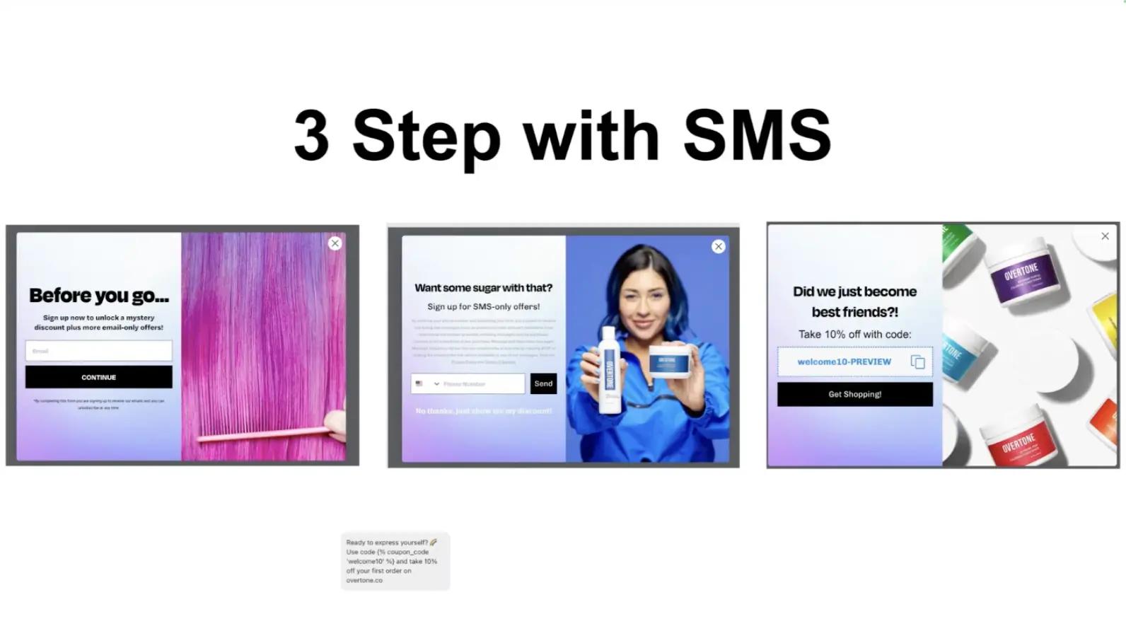
It works like this:
- The exit pop-up is customized for the product page.
- The pop-up asks for an email address in exchange for a mystery discount.
- After the shopper inputs their email, the pop-up asks for a phone number in exchange for SMS-only offers—a higher-risk, higher-reward strategy that may cost a few email addresses.
- People don’t need to input their phone numbers to get the discount—there’s an option to move past the phone number field to get it anyway.
- The last step of the form shows the discount code—shoppers can copy it for immediate use while they’re still on the website.
While multi-step forms are often considered more risky than forms with a minimal number of fields, the strategy paid off big time for oVertone, Firestone says.
Over the year it was set up, 1.2M people saw the pop-up and 60K people submitted it, which translates to a 5% conversion rate—a massive success for an exit pop-up.
3. Use conversion asset stacking for your email layout
“Conversion asset stacking is when you stack assets like an image, a customer testimonial, a video, a piece of social proof, and sales copy together in such a way that when somebody is consuming your message, they’re going to be compelled to make a purchase decision”—at every step, Firestone explains.
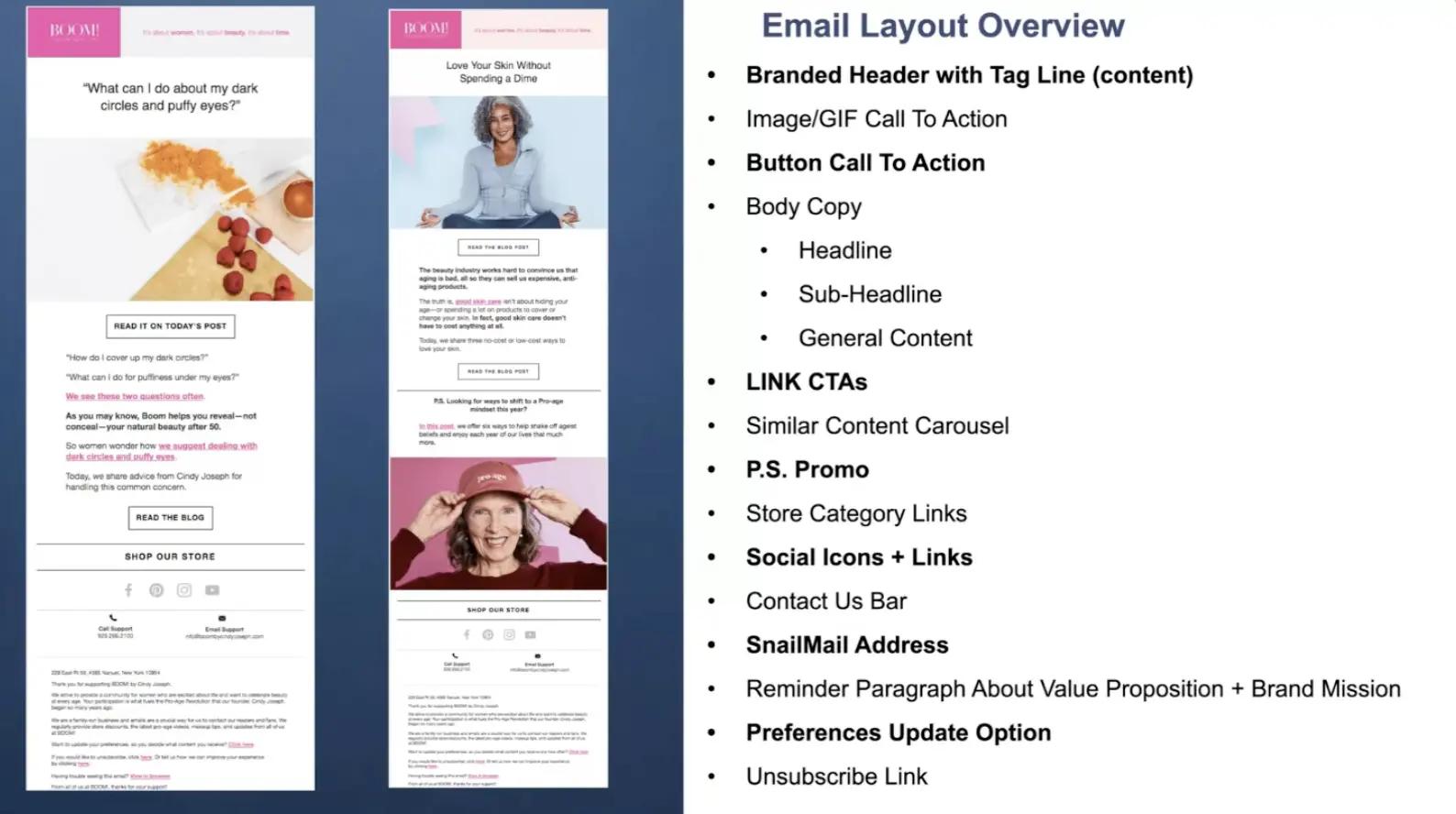
The point is to give people choice around how they convert to the next step in your buyer journey.
“In ecommerce, every type of communication or screen is designed to get people just to take the next step,” Firestone says. “The headline is designed to get people to read the subheadline. The subheadline is designed to get people to the call to action (CTA), etc.”
Here are a few of Firestone’s email layout must-haves:
- Image/gif CTA: “Some people click on text, some people click on gifs, and some people click on images. If we just had a text link, we would get 26% less clicks than having an image CTA and button CTA.”
- Similar content carousel: “We find that 8-10% of people will engage with a similar content carousel, which is for people who aren’t interested in the main piece of content but would click on something else.”
- Pre-unsubscribe link reminder: “Brands often ignore this section. You need an unsubscribe link to comply with CAN-SPAM laws, but what we do is also include a reminder paragraph about our value proposition and brand mission above that link. Since we started including this, we’ve reduced our unsubscribes by half.”
To find out what Firestone recommends for SMS—and see examples of his gorgeous SMS-only offers—skip to 37:53 of his talk.
With an active email audience of 250K people, Kagan is a master of engaging audiences with owned channels. Put his tips and tricks to work for your brand.
4. Build trust with your email flows
Last year, Boom! generated more than $6.3M in Klaviyo-attributed sales (sales that are generated from emails or SMS messages sent from Klaviyo).
Of that, 72% came from campaigns and 28% came from behavior-triggered flows. This is the split Firestone recommends at a high level for campaigns vs. flows.
It’s tablestakes to have flows that sell—think abandoned cart emails that redirect people back to their pre-populated carts. But Firestone insists that flows are most useful when they’re building trust between your audience and your brand.
These are the types of content he sends automatically when people subscribe:
- Trust builders: social proof, case studies, science, manufacturing process transparency
- Content messages: current events analysis, education, curated content, reaction content, interviews, etc.
- Offers: product announcements, sales with deadlines, product cross-sells, pre-order campaigns, affiliate offerings
- Pre-sell articles: to create excitement for new product drops
But not every flow content type will fit for every subscriber. This is why Firestone splits his flows into several categories, 3 of which include:
- Early stage pre-purchase: welcome sequence, content opt-in, etc.
- Hot lists: offers and pre-sell articles, abandoned cart, browse abandonment, etc.
- Post-purchase: transactional emails, win-back, repeat purchase, early-bird launches, brand ambassador, etc.
5. Send pre-arrival emails as part of your post-purchase experience
“If you do nothing else that I show you today, do your post-purchase flow well,” Firestone says. “And one way to do that, which no one is doing, is to send pre-arrival emails.”
Pre-arrival messages are emails and texts you send to customers before their package arrives. They are designed to do 4 things:
- Build excitement for the product that’s about to arrive
- Reduce buyer’s remorse
- Reduce refund rates
- Increase customer reviews
“You need pre-arrival emails to build excitement and to remind them why they bought from you in the first place,” Firestone says. “This is as much to get them excited about the product they just bought as about your future products.”
As part of this flow, Firestone sends:
- Unboxing videos
- Good press
- Social proof videos
- Scientific case studies
- Ownership benefit reminders
- Brand FAQs
- Personal stories
- Market-relevant stories
Skip to 57:19 of Firestone’s talk to hear his full recommendations for post-purchase flows. And check out his latest Shopify app, One-Click Upsell, which is built for the post-purchase flow.
Firestone had so much more to say about what’s worked for him over the course of his 20-year ecommerce career. Watch the entire event, A proven framework to maximize your email & SMS revenue, for more examples, benchmarks, and recommendations for SMBs.
Power smarter digital relationships with Klaviyo SMS.
Get started

