Total Halloween spending in 2-23 was set to exceed $12.2 billion.
That’s according to the National Retail Federation, which also reported that consumers planned to spend a record $108 each for Halloween, between candy, decorations, costumes, and party supplies.
If your brand sells makeup, clothing, or food and beverages, your Halloween email marketing strategy may be a no-brainer. But there’s plenty of spend to go around if you don’t fit neatly into these categories.
Creating a Halloween email is much like conjuring up a spectacular costume: it takes a bunch of brainstorming, a dash of artistry, and a sprinkle of guts to produce an email marketing campaign that’s hauntingly click-worthy.
Regardless of how your audience intends to spend this Halloween, there are ways to make your email marketing campaigns out-of-this-world relatable and applicable to their plans. You just need the magic words—and images and layout.
Here are 7 examples of brands that got their Halloween email just right.
1. Tropic Skincare plays with the colours of the season
Just because your products don’t directly relate to Halloween doesn’t mean you have to sit on the Halloween marketing sidelines. Find inspiration from the quintessential colour scheme of the festivities and share Halloween messages that visually engage your subscribers.
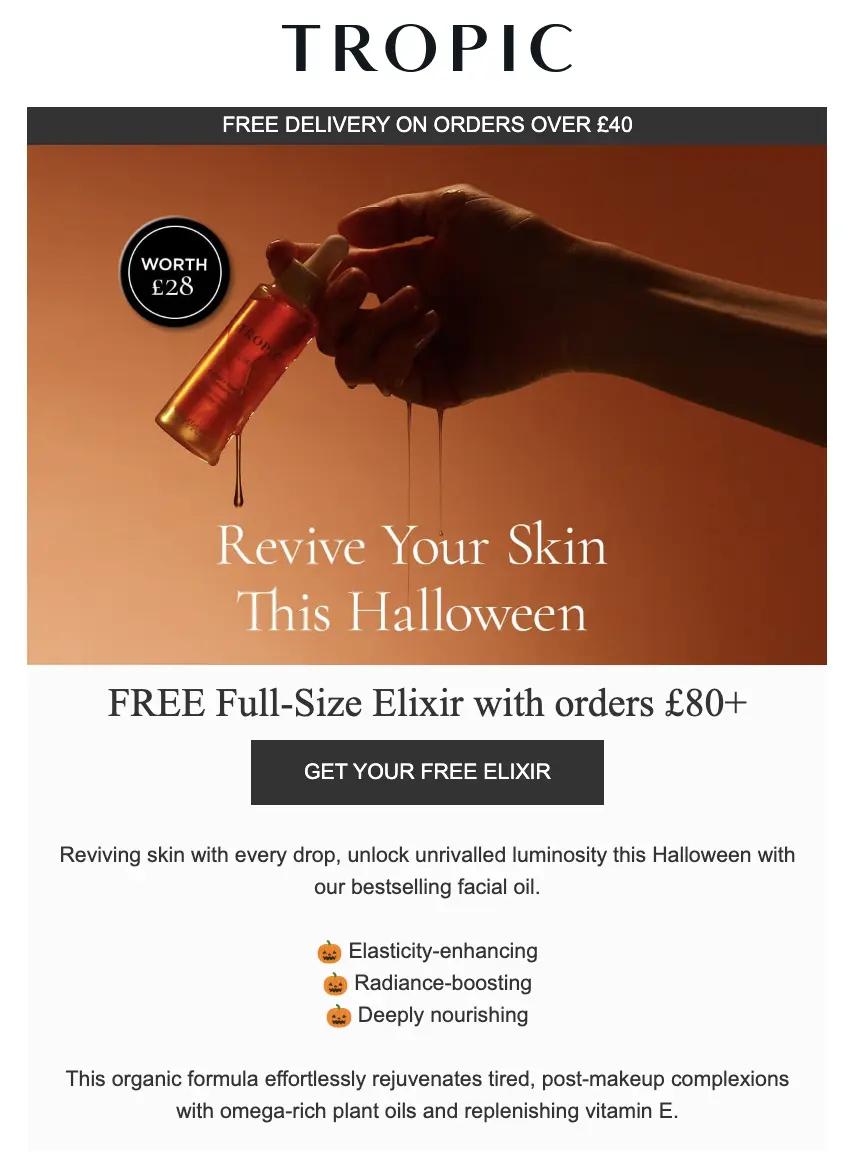
In this Halloween email, adventure brand Tropic Skincare showcases their bright orange travel bag product line against a black background. They keep their call to action (CTA) simple, encouraging subscribers to “Get your free elixir.”
With the added touch of the dripping bottle, Tropic Skincare visually evokes the Halloween spirit—while keeping the copy of their Halloween email short and sweet.
Source: Tropic Skincare
2. Josh Wood Colour puts people first, products second
Seasonal events open the door for you to build relationships with your brand’s community through a shared experience. You build these relationships through conversations—not just sales (although an enticing promotion never hurts).
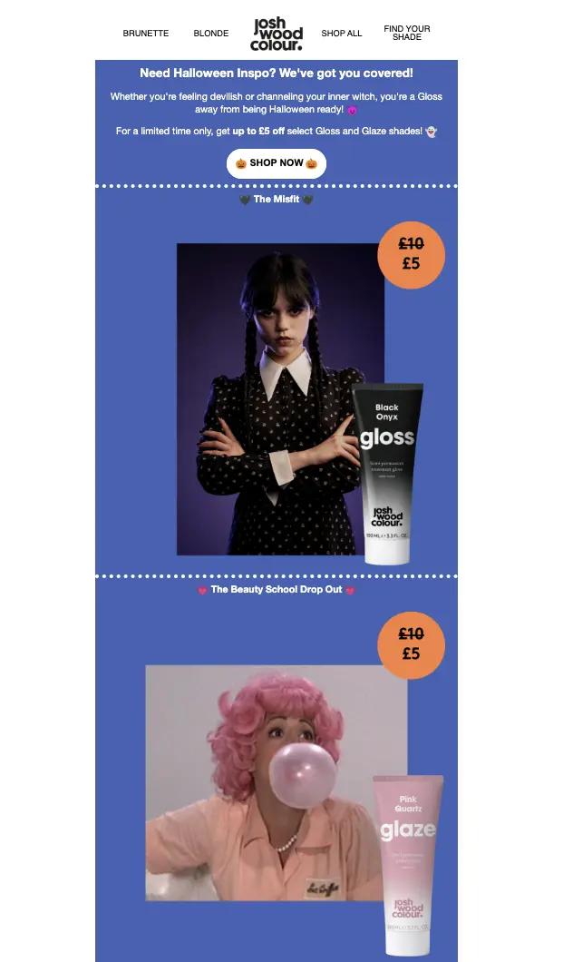
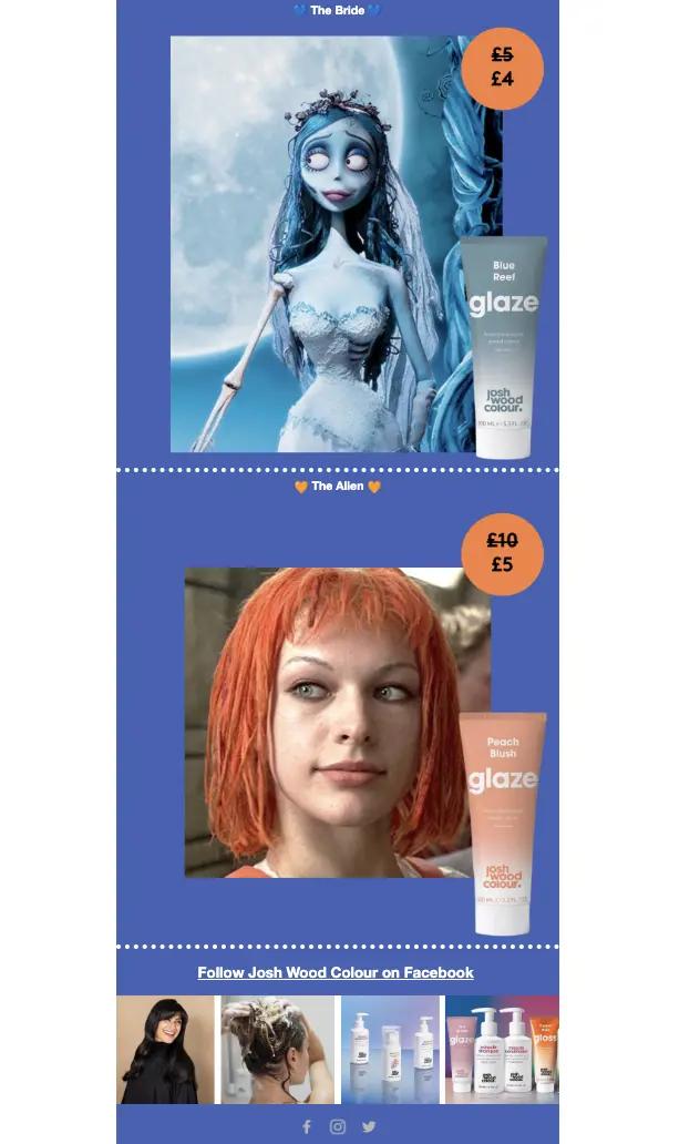
In this Halloween email, hair care brand Josh Wood Colour pairs their team’s cosy, in-home Halloween evenings with their movie favourites. You may not think Halloween and hair products are a match made in heaven, but Josh Wood Colour makes it work by focusing on their spine-chilling film recommendations and the creepy characters that subscribers can relate to (in terms of hair, at least).
Source: Josh Wood Colour
Source: Josh Wood Colour
3. Kitsch explains the magical properties of their products
Do you sell hand-stitched throw blankets? Or clothes made from the softest, most sustainably grown organic cotton known to humankind? Are your beauty products filled with clean, all-natural elixirs that’ll get rid of even the deepest crow’s feet?
Your Halloween email campaign can serve as the perfect means to share the unique qualities of your products—the things that make them truly magical.
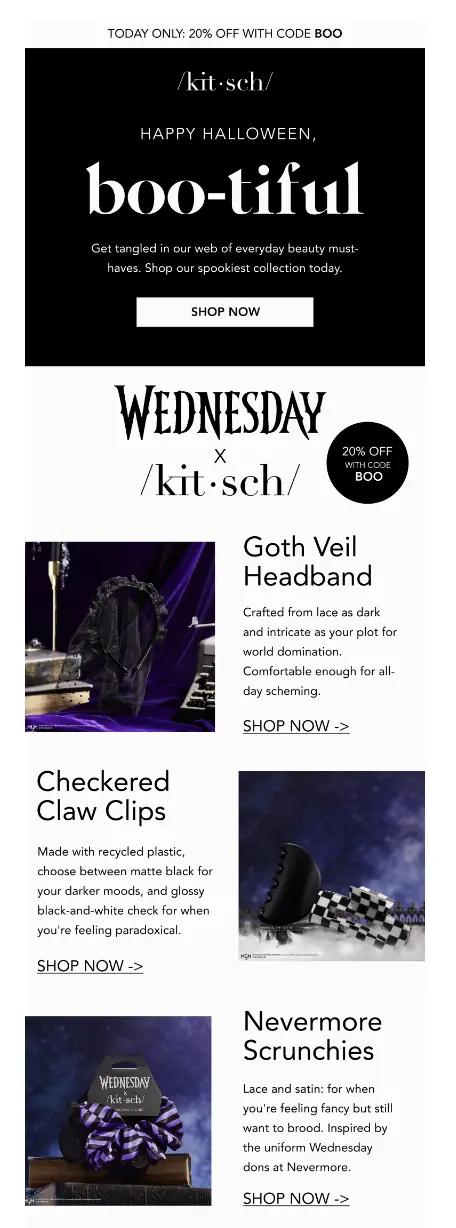
Kitsch, a brand that sells hair and beauty products, takes this seasonal email as an opportunity to have fun with their product details with spooky names while also flagging the unique properties of their products.
With a time-dependent offer and some cheeky copy to boot, Kitsch effectively drums up brand awareness and potentially some product sales.
Source: Kitsch
4. Minor Figures creates mystery—and community
Not every marketing email has to include product information and big sales. Millions of people spent a lot of time on their phones during the more active stages of the pandemic—which means that now, people may find themselves heading online to feel like they’re a part of something.
Minor Figures, a coffee company, boils down their Halloween email to 4 CTA buttons with alternating copy: “trick” or “treat.”
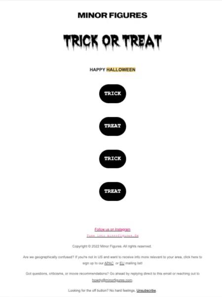
Source: Minor Figures
When people click on one over the other, they might see a creepy image. Or a funny one. Or a cute one. It’s a Halloween Choose Your Own Adventure that ends in delight rather than a sale.
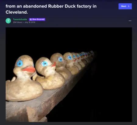
Image source: Minor Figures
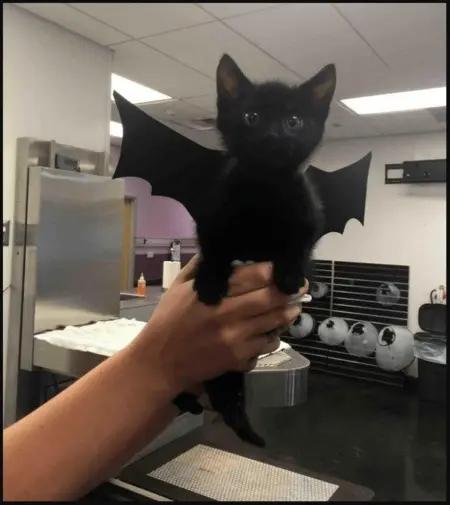
Image source: Minor Figures
Does a move like this necessarily help you sell more products? Not likely—or at least, not in the immediate term. But it can go a long way toward building brand awareness, and it creates a relationship with your subscribers that goes beyond the transactional.
5. BirdDogs tells a ghost story
One of the goals of any marketing email is to get your reader to read the entire thing—or at least scroll far enough to reach the CTA button.With that in mind, why not tell an actual story? One that will keep them on the hook, complete with images and funny, on-brand storytelling?
BirdDogs, a men’s apparel brand, sent this Halloween email with comic-book-like vignettes and irreverent, on-brand storytelling.
The CTA isn’t until the very bottom—and it doesn’t exactly announce itself. But we still think this is a clever, entertaining move that could help build trust with your subscribers.

Image source: BirdDogs
6. Diablo Cosmetics offers devilish discounts
Why not use Halloween as an excuse to get some merchandise in front of your subscribers? If a generous discount offer is in your brand’s future, time it so it lines up with Halloween.
Diablo Cosmetics seizes Halloween as an opportunity to offer a real treat: a big incentive to purchase with a 15% discount on limited .
The Halloween-themed font, bold copy and simple design offers subscribers a simple but compelling choice.
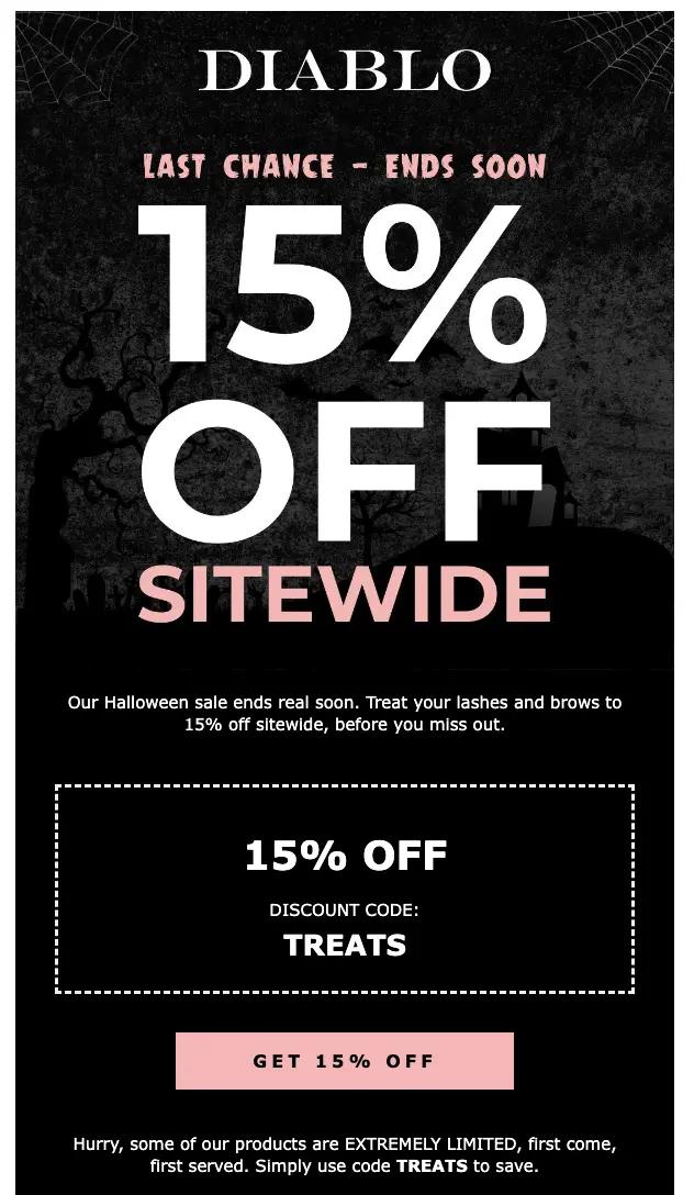
Image source: Diablo Cosmetics
7. Heist develops a Halloween product launch
Consumers have plenty to shop for leading up to Halloween: costumes, candy, home decorations, and party supplies, to name a few. If your inventory doesn’t fall into one of those categories and you want to sell more products during this season, you may have to do something special.
Consider a product launch—or a “first ever” event.
Heist, a fashion brand that specialises in women’s base layers, uses this Halloween email to launch a Halloween collection.The email includes high-quality product close-ups and links above the fold that take the subscriber directly to the relevant product pages.

Image source: Heist
Visit the 2024 Black Friday hub to make this your best sales season yet
Visit the hub


