10 email newsletter examples that sell without the hard sell
Brain Pickings. Morning Brew. The Skimm. The Daily Beast. The Morning Newsletter by The New York Times.
These are some of North America’s most popular newsletters, and they all have one thing in common: They give people useful information they wouldn’t get anywhere else in an accessible format.
Your brand’s newsletter won’t look exactly like these newsletters. You have a product to sell, and your email marketing strategy is measured at least in part by the revenue it generates.
But that doesn’t mean your newsletter shouldn’t aim to be useful. When you mention products, can you teach people something novel and interesting about them? Can you tell a memorable origin story? Can you change the calls to action (CTAs) to make sure people don’t feel sold to when they’re reading your newsletter?
If you’re ready to get started on production, learn all about how to create a newsletter. If you’re looking for inspiration, you’ve landed on the right page.
Here, we show you 10 newsletter examples from brands that balance the product highlights with the informative—and sometimes even delve into the entertaining.
1. Graza showcases delicious ways to use their product
Roundup posts are common, and they’re a great way to pack a ton of value into a newsletter while giving the reader a lot of learning opportunities.
Olive oil brand Graza sends this long, colorful newsletter with no less than 11 CTA buttons, each leading the reader to a recipe of their choice. With mouthwatering images and descriptive tag copy like “fall-off-the-bone good,” Graza understands their audience is made up of foodies who care enough about the quality of their olive oil not to buy it from the grocery store.

Pro tip: Plan to send this kind of newsletter at predefined intervals that correlate with how frequently you create content (i.e., weekly, monthly, quarterly, etc.).
2. Who Gives a Crap leads with entertainment
Let’s face it: Bathroom humor is universally funny. Australian toilet paper brand Who Gives A Crap sends this cheeky guide to “bathroom guest etiquette” with silly how-to copy that walks the line between useful and ridiculous.
The entertainment does a great job in leading the reader to the main message: A subscription helps you be a prepared host. But for the folks who might not need the entertainment because they’re ready to buy, there’s a CTA at the top as an option. (We’d love to see the performance metrics on that one!)

Pro tip: If your product is subscription-based, use your newsletter as an opportunity to feature the benefits of the subscription by:
- Offering a deal on a new subscription
- Breaking down the savings that come along with a subscription
- Featuring user-generated content (UGC)
3. Farmer Jones Farm builds local community
If you’re a local business, gathering people in real life may be your superpower. Locality and community are two of the most significant drivers of relevance in newsletter content, so you won’t want to sleep on this tactic if a lot of your customers are in one area.
Here, local brand Farmer Jones Farm opts for simplicity with their newsletter, sending a simple and easy-to-read list of upcoming events.

4. FARM Rio showcases products for ready-to-buy segments
You can try sending newsletters that showcase your products as the entré—but we recommend sending these types of newsletters to an audience segment that’s a little more ready to buy than others.
If you’re sending to the right people, product-focused newsletters are a great way to grow your revenue, especially if your brand releases new products or updates older ones on the reg. These newsletters can include additional information, links to the products, or coupons and discounts.
Fashion brand FARM Rio sends this newsletter featuring new styles all in the same color palette: blue and white. With a single CTA button at the bottom, the design leans more into news than sales.

5. Faherty communicates a strong mission
If you have a strong company mission that evokes emotion—and a great story to tell along with it—a newsletter that reveals the progress you’re making on that mission may work well for your audience.
When you give your subscribers a behind-the-scenes look at your company, your employees, and your customers, you’re creating deeper connections and spreading awareness—which translates to being top of mind the next time people need what you’re selling.
Clothing brand Faherty sent this newsletter to announce a clothing reselling program. With direct, informative copy and clear instruction on how to participate, the email provides value to the subscriber while encouraging them to do the environment a small favor.

The same brand sent this email out around their 10-year anniversary. It strikes a humble, grateful note, including personal photos and sincere copy.

A newsletter like this may not drive a ton of sales right away, but it’s likely to encourage brand loyalty and make your brand “sticky” in the minds of your audience.
6. KORA Organics and Sakara team up on a novel idea
There’s strength in numbers—and sometimes in unlikely pairs. Don’t underestimate the element of surprise to create engagement, which is what skincare brand KORA Organics and organic meal delivery brand Sakara capitalized on to announce their product collaboration.
With gorgeous co-branded images and copy that explains how these two companies paired up, the partnership uses novelty to bring food and beauty together. Also note how separate tiles and CTA buttons for each brand’s products are likely to enhance the chances of conversion.

7. HOMAGE pays homage to Juneteenth
If it makes sense for your brand and your audience, your newsletter can be a great place for activism.
You’ll need to be smart with this strategy—is your brand really the best source for the information you’d like to communicate? But when you do it right, you’ll provide your audience with some education they may just appreciate.
Apparel brand HOMAGE uses their newsletter to educate people on the history of Juneteenth and highlight local partners who support the African American community. Only at the very bottom, with an understated CTA button, is there any link to a page where subscribers can actually shop—in a newsletter like this, it shouldn’t be obvious, or sometimes even present, by design.

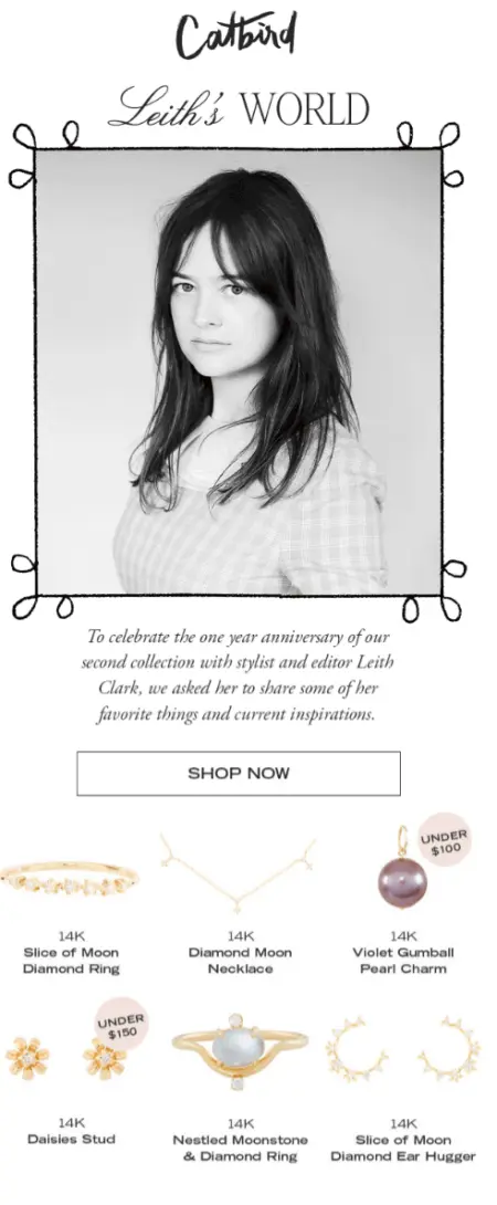
8. Catbird builds recommendations around a style authority
Everyone loves a good recommendation. If you’ve ever gone to a bookstore and lingered over the staff recommendations shelf, you may want to try recreating this phenomenon in your newsletter.
This example from Catbird combines an anniversary email with recommendations from style authority Leith Clark, who pulls an Oprah and shares her favorite things for the newsletter.
9. Birddogs embraces the unhinged with satire
If your brand can be zany, lean into it—hard. If you’ve got the budget and bandwidth, get your team to write—and illustrate—an engaging story.
Menswear company Birddogs sent this zany email a few days before Father’s Day. It’s got an attention-grabbing subject line: “Is Elon Musk A Good Dad For Naming His Kid X AE A-12?” The preview text reads: “Wait till you see what his brother Ernie did.”
The email then tells a (totally fake) story about what Musk’s (also fake) brother named his (imaginary) kids. It’s entertaining and just wacky enough to hold a reader’s attention. The CTA is simple: “Get your dad some new pants.” It sits at the very bottom, but it stands out visually.

10. Joggy grabs attention with provocative newsletter copy
CBD brand Joggy sends this newsletter with attention-grabbing headlines. The binary of “myth” vs. “truth” naturally sparks curiosity, and the placement of the words gives readers a clear content roadmap.

What’s next: Create a dynamic newsletter for multiple audiences
After you learn the basics, the next step is to level up with audience segmentation and dynamic content—but you’ll need to collect high-quality subscriber data to pull it off.
Drive results with relevant content via a customer data platform that houses people data and email under one roof.

