Total Halloween spending in 2024 was $11.6 billion.
And according to the National Retail Federation, consumers planned to spend $104 each for Halloween, between candy, decorations, costumes, and party supplies.
If your brand sells makeup, clothing, or food and beverages, your Halloween email marketing strategy may be a no-brainer. But there’s plenty of spend to go around if you don’t fit neatly into these categories.
Even more importantly, Halloween is a great testing ground for the most lucrative shopping event of the year: Black Friday Cyber Monday (BFCM).
So even if your products aren’t an obvious fit for Halloween, the holiday is still an important milestone for gathering the customer data you’ll need to make BFCM more profitable than last year.
Here are 6 Halloween marketing strategy examples from brands that got their email and SMS concoctions just right.
Align your marketing campaigns with relevant holidays and year-round celebrations.
Get your marketing campaign calendar1. Showcase and collect social proof ahead of BFCM
According to Klaviyo’s future of consumer marketing report, reviews and feedback are more influential to a first purchase than competitive pricing and discounts.
So, before you start discounting for your Halloween campaign, you may want to consider leaning more heavily on reviews instead. This strategy, of course, depends on whether you already have a good amount of social proof for the product you intend to push during BFCM.
Hear us out: if your products fall neatly into a Halloween category and you’ve done the legwork of collecting social proof for those products, try featuring those reviews in your email campaigns in lieu of discounts.
If, on the other hand, your products aren’t an obvious Halloween buy, use the holiday as an excuse to offer a discount in exchange for a review on a product you plan to feature prominently during BFCM. Your Cyber Week self will thank you later.
Halloween marketing example: Supply uses social proof to highlight product benefits
Do you sell hand-stitched throw blankets? Or clothes made from the softest, most sustainably grown organic cotton known to humankind? Are your beauty products filled with clean, all-natural elixirs that’ll get rid of even the deepest crow’s feet?
Your Halloween email campaign can be the perfect place to let your customers tell those stories.
Supply, a brand that sells personal grooming products, takes this seasonal email as an opportunity to feature social proof from a satisfied customer. If you’ve received a glowing review like this one for Supply, Halloween is as good a time as any to show it off to your audience.
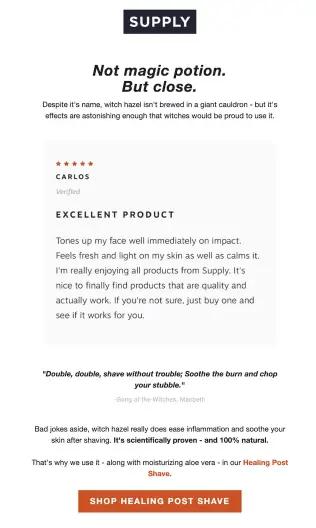
Image source: Supply
2. Gather customer data in a way that fits the holiday
Customer data is, hands down, the most important tool in your B2C revenue toolbox.
With 74% of consumers expecting personalized experiences in 2025, according to our future of consumer marketing report, there is little growth to be had without the customer data needed to create the brand experiences people have come to expect.
So, rather than think of Halloween or Labor Day as less lucrative, “in-between” holidays, think of them as customer data-gathering expeditions. Launch Halloween campaigns that ask questions and offer small benefits in exchange for information that can lead to more targeted BFCM campaigns.
Halloween marketing example: Minor Figures splits their audience into “trick” or “treat”
Minor Figures, a coffee company, boils down their Halloween email to 4 CTA buttons with alternating copy: “trick” or “treat.”
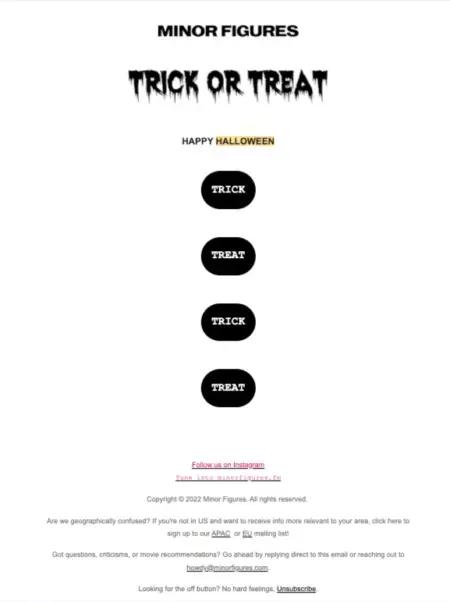
Image source: Minor Figures
When people click on one over the other, they might see a creepy image. Or a funny one. Or a cute one. It’s a Halloween Choose Your Own Adventure that ends in delight—and, most importantly, a vibe check on the brand’s audience.
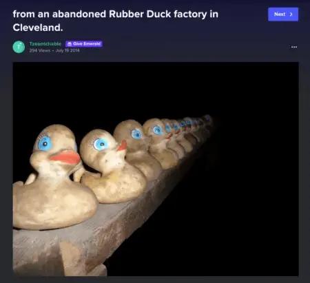
Image source: Minor Figures
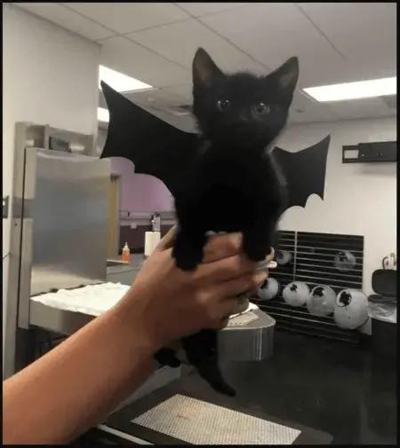
Image source: Minor Figures
Does a move like this necessarily help you sell more products? Not likely—or at least, not in the immediate term. But, depending on how you split your CTAs, it can give you some valuable information that can help you sell more effectively to smaller subsets of your audience during busier times of the year.
3. Establish a more memorable brand presence ahead of BFCM
If you’re selling in a highly competitive market and don’t want to compete on price with heavy discounting, increasing your top-of-mind brand awareness may be your best bet ahead of BFCM.
And because Halloween is such a cheeky holiday to begin with, it’s also a perfect time to test bolder versions of your brand voice and look. While there are plenty of use cases for email templates when you need to scale, feel free to go off script for Halloween so people remember your brand when holiday shopping rolls around.
Halloween marketing example: BirdDogs tells a ghost story
One of the goals of any marketing email is to get your reader to read the entire thing—or at least scroll far enough to reach the CTA button.
BirdDogs, an apparel brand, sent this Halloween email with comic book vignettes and irreverent, on-brand storytelling.
The CTA isn’t until the very bottom—and it doesn’t exactly announce itself. But we still think this is a clever, entertaining move that could help build memorability with your subscribers.

Image source: BirdDogs
4. Test your BFCM discount strategy during Halloween
On the other hand, if you know discounts are going to be the primary focus of your BFCM email campaigns, you can use Halloween to test your discount pricing strategy.
A thoughtful discount strategy can move your brand away from sweeping discounts—which are expensive—and more toward a targeted approach. During Halloween, you can test discount tiers on different segments of your audience, based on browsing behavior, previous purchases, and stated interests.
If you see outstanding results during Halloween from a 10% discount sent to people who bought within the past 6 months, that may be the permission you need to branch out beyond steep discounts during BFCM.
Halloween marketing example: HOMAGE offers BOGO sales—and seriously big discounts
If a buy-one, get-one-with-a-discount offer is in your brand’s future, time it so it lines up with Halloween.
HOMAGE, a sports apparel company, seizes Halloween as an opportunity to offer a real treat: a big incentive to purchase through buy one, get one 40% off.
Not only that, the products are Halloween-themed, each with their own CTA button that reminds subscribers of the 40% they’ll get off a second purchase.
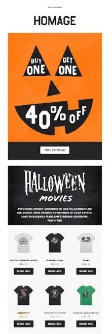
Image source: HOMAGE
5. Send Halloween-themed early access product bundles to SMS subscribers
According to Klaviyo’s 2024 SMS consumer trends report, most people only subscribe to 2–3 brands via SMS. If you’ve got a customer’s digits, you’re special—and you have access to one of the best audience segments for speeding up time to purchase.
The same study found that 65% of people who made an SMS purchase in the last year said it was something they were planning to buy in the near future or in a few months—and they ended up buying the item earlier than they planned to because of a promotional text message.
If you see, based on browsing behavior, that subscribers are visiting certain product pages a certain number of times, consider building a Halloween product bundle that reflects this early intent to buy.
SMS subscribers love early access to products, and a bundled offer for products they’re already considering could be the final nudge needed to make the sale.
Halloween marketing example: The Dog Bakery unlocks early access to a product bundle
The Dog Bakery sells dog treats and celebration cakes. Here, they give their text messaging subscribers early access to a Halloween bundle with a special MMS message. The kooky, on-brand image and short copy get straight to the point, giving the subscriber everything they need to take advantage of the early access.
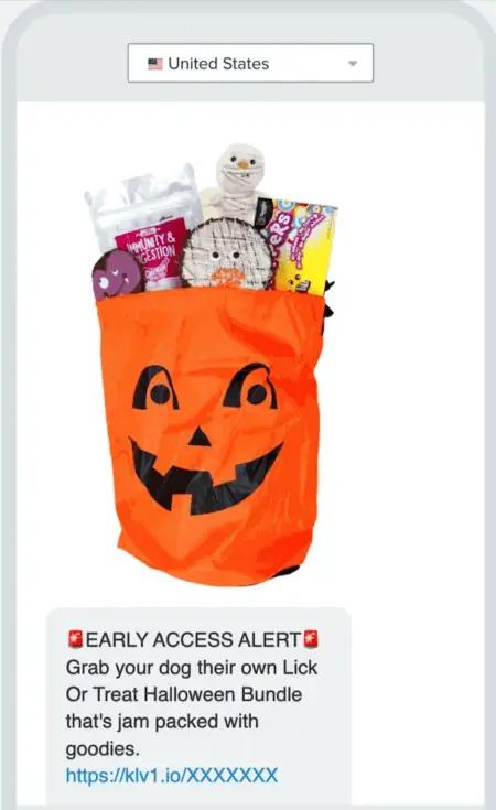
Image source: Klaviyo Showcase
6. Build urgency with a countdown to Halloween
Urgency is a great way to drive sales, and there are plenty of ways to create it. But a countdown clock—one that updates in real time, accurate to the subscriber’s time zone—does a lot of that work for you.
Your Halloween countdown campaign can also help you build an audience segment that responds to urgency. When you delineate between those who respond to urgency vs. discounts, you can see more profit simply by targeting the right people with the right message at the right time. Halloween is also a great time to collect that data ahead of BFCM.
Halloween marketing example: Essentia creates real urgency with a countdown clock
Essentia, an organic mattress company, held a “midnight madness sale” on Halloween, and sent this email at 12:00 a.m. local time. At the very top is a countdown clock, so whatever time the subscriber opens the email, they can tell how much time they have left to take advantage of the deal.
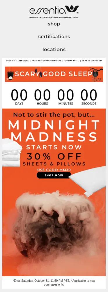
Image source: Klaviyo Showcase
This is great for a few reasons:
- It’s personalized. The subscriber doesn’t have to do any work to figure out how much time they have left to buy.
- It’s considerate. While creating urgency, it also lets you know that if you can’t shop right now, you can mark your calendar for a few hours ahead to look through the products and see if you can take advantage.
- It’s clear. Positioned at the top of the email, the clock is front and center so the reader can’t miss it. It’s easy to catch, and it’s easy to refer back to—after the reader checks out all the other good stuff in the email (social proof, additional discounts, and delivery details).
Learn how to add a countdown timer to your emails in Klaviyo.
Gather customer data and test BFCM strategies with Klaviyo B2C CRM
Even if Halloween doesn’t generate the most Q4 revenue for brands, it’s the perfect opportunity to gather customer data and test discount strategies ahead of BFCM.
Your future revenue is in large part determined by how well you can personalize your campaigns year-round—and that means centralizing everything you know about your customers in a single profile.
Klaviyo B2C CRM—the CRM built for B2C—makes it easy for brands to collect the zero- and first-party data they need to deliver personalized experiences for their customers. As a data platform with email and SMS automation, customer service, and analytics under one roof, Klaviyo B2C CRM is making it possible for brands to scale personalization for thousands or even millions of customers.
Boost sales and engagement all year long with Klaviyo
Sign up

