Over 75% of all businesses report email marketing as a top 3 ROI-generating channel, according to the Klaviyo marketing mix report .
The good news, there: You can invest in your email marketing strategy without much overhead.
The other news: People receive an overwhelming number of marketing emails each day.
Just look to your personal inbox for proof.
Whether you hire email marketing experts or not, excellent marketing email templates are readily available on the web. To tweak an email template to suit your needs, though, you need to understand the basic components of an effective marketing email.
In my 10 years as an email strategist and designer at Spark Bridge Digital , I’ve helped 100+ brands stand out in the inbox with strategic email design.
Let’s get into what you need to know.
3 elements of good email design
When you see a great marketing email, several design elements are coming together in the background to earn and keep your attention—possibly even inspiring you to click through to a product page.
But 3 of those are table-stakes, must-have, can’t-forget elements:
1. Email header components: keep it simple
The top of an email may vary based on templates, but headers typically include:
“Eyebrow” copy
Eyebrow copy lives above the header and conveys important information you don’t want to take up space in the body of the email.
Your brand’s logo
Your brand’s logo needs to be front and center. This cues your subscriber to connect with your brand as they read—or skim—the email, reinforcing brand recognition and affinity.
Some brands include social links at the top, but these can crowd the space and often look better in the footer.
Rihanna’s beauty and skincare line Fenty keeps the header components simple and streamlined, with just eyebrow copy and the brand’s logo ahead of the main headline.
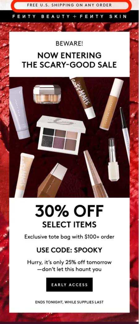
Image source: Fenty
2. Visuals and copy: it’s all about balance
Visuals play a significant role in engaging customers, so it’s well worth it to invest in creative that establishes your brand’s visual identity. This includes choosing the right balance of:
- Photos
- Illustrations
- Mixed media
- Infographics
While the visuals communicate the feel of the email, the copy delivers the message. Don’t lean too heavily on one or the other.
“I still see lots of brands sending image-only emails, and these can be slow to load or show nothing but the unsubscribe link when the user is out and about and coverage might be poor,” explains Hannah Spicer, director of Hannah Spicer Consulting . “Always include some text in your email.”
Jeni’s Splendid Ice Creams takes this advice to heart. In this email, they prioritize cheeky, fun images, but they’re not afraid to write out an entire paragraph so the reader has the chance to understand the value Jeni’s is offering: kid-sized gift cards, designed just for Halloween, available only in scoop shops.

Image source: Jeni’s Splendid Ice Creams
Pro tips:
- Optimize your emails for mobile to avoid long loading times.
- Pay attention to the email background. Jeni’s uses a soothing purple, which offsets the colorful images and CTA buttons, but patterns can make emails pop and set your brand apart.
- Be strategic about CTA placement. While you want to give your reader plenty of opportunities to click through to your product pages, you also don’t want to overwhelm them with too many buttons.
3. Email footer: you can do way more here than you think
Your email footer is—you guessed it—all the way at the bottom of your marketing email, and it’s a great place to put elements that help you stay compliant, like:
- An unsubscribe link
- A link to change email preferences
- Social links
- Business address
But focusing on compliance doesn’t mean sacrificing creativity.
Toilet paper brand Who Gives A Crap makes good use of the space in the footer of this email. The icons indicate both important and playful information about the brand, their social links are spaced so they’re easily visible, and they list their mailing address and the required unsubscribe link.
They also include a lengthy land acknowledgement in humble and sincere tones. If a subscriber makes it all the way to the footer of the email, they’re likely to gain more respect for the brand.
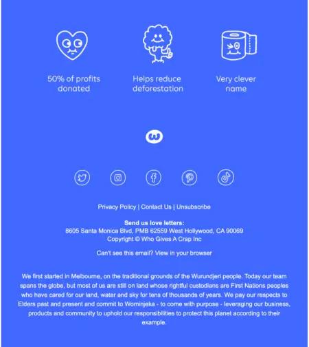
Image source: Who Gives a Crap?
Email design trends: a look into the future
Whether you’re announcing new products, sharing relevant industry news, sending discounts, or communicating via transactional emails, here are 5 time-tested email design trends to make your own this year:
1. Minimalism: say more with less
Let’s face it: We all ingest too much information every day. Pair that with the fact that our inboxes are overflowing, and your subscribers are likely receiving your marketing emails in a state of burnout and distraction—even at their best.
So, why not make your emails easy on the eyes? Nathan Doverspike, customer success manager at Klaviyo, says a minimalist trend that has been predicted for a few years is just now showing up in inboxes.
He says he sees brands “pushing storytelling through images without a lot of text.”
This marketing email from sparkling herbal water brand AURA BORA is easy to comprehend, funny, and, to Doverspike’s point, it’s not overwhelming. The brand takes a risk by not showing any products or featuring any new flavors—and that’s one of the reasons it stands out.
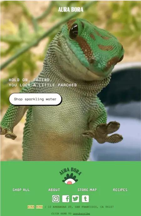
Image source: AURA BORA
Pro tip: If you’re looking to keep your emails minimalistic and want to lean less on your creative team, consider using AI-generated imagery—another trend that’s expected to pick up in 2024.
2. Gamification of the email experience
Joseph Siegel , director of retention and ecommerce at Feastables , recommends earning attention and clicks with gamification. “The brands with the strongest creativity are going to win in the inbox,” he says. “In a sea of static sends, interactive email will help you stand out.”
The brands with the strongest creativity are going to win in the inbox.
Before you start worrying about the idea of offering endless discounts as part of the gamification process, Siegel reminds us, “You don’t have to center all your emails around winning free products.”
Take, for example, Feastables’s marketing email below. It doesn’t feature any products, and yet it still garnered engagement from thousands of subscribers.
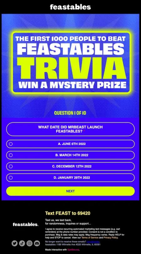
Image source: Feastables
Even better, when the user gives the wrong answer, they get this screen—which populates directly in the email—encouraging them to re-open the email. The Feastables team uses Spellbound.io to build interactive emails. They enter code when building the email, and when a user clicks on a certain portion of the email, a flow specific to that choice is triggered.
While it’s a certain type of user who is up for this type of interaction—one who wants to play a game—the right audience will enjoy it, and will help boost your sender reputation by encouraging multiple interactions per email.
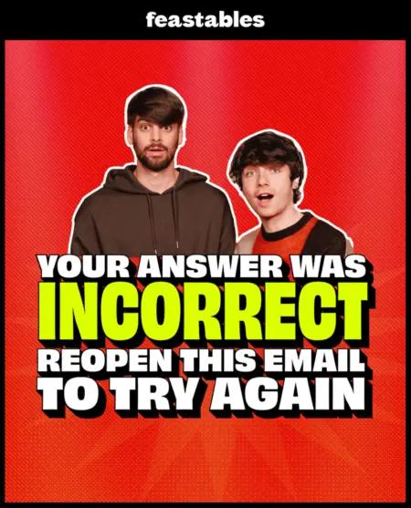
Image source: Feastables
Pro tip: Gamification is not for every brand.
“Gamification doesn’t work across all email providers,” says Morten Bustrup, senior creative director at Elva . “While a certain video or GIF might work within an iOS format, it might not work as well in other email clients. While brands tend to see higher interactions with any kind of motion, they have to focus on what actually gets delivered, opened, and engaged with.”
While brands tend to see higher interactions with any kind of motion, they have to focus on what actually gets delivered, opened, and engaged with.
3. Interactive marketing emails
A step down from gamification are emails that are simply interactive.
Depending on your brand identity and the demographics of your audience, you may not want to send interactive emails regularly. But, “if you mix them into your strategy,” Siegel says, “it trains your subscribers to go after that feeling of fun each time they see you in the inbox.”
This cheeky Feastables email encouraging readers not to click saw engagement from thousands of people. And it’s no wonder—once the reader clicks, they’re met with silly, original copy that draws attention before finally taking them to a product page.
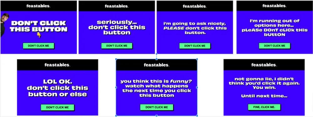
Image source: Feastables
4. AI-powered product recommendations
Personalization isn’t new on the scene. This tactic has been around—and considered a best practice—for some time. But what Antunes expects to happen more in 2025 are product recommendations that are powered by AI—which can play a big role in increasing conversions.
A great customer data platform will make the most of the data you’ve collected.
“Leveraging your customer data and pulling it into emails will make them more effective,” Antunes says. “Have data on what they’ve bought a lot of in the past? Use that to show them products they’ll likely be interested in in the future based on their predicted date of next order.”
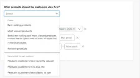
Image source: Klaviyo
5. Boldness in design—especially in the hero banner
Science-backed luxury skincare brand True Botanicals not only maximizes their header to share their most appealing offer—they do it while referencing elements of their product. In this case, that means a header designed to look like face or body oil.
“The hero banner in this email is exceptionally well executed,” says Zac Fromson, co-founder of Lilo Social , the full-funnel ecommerce growth agency that True Botanicals works with. “It instantly grabs attention with its luxurious, golden-hued liquid design that mimics the texture of skincare oils.”
“This creative choice not only aligns with the theme of radiance, but also visually reinforces the idea of nourishment and glow,” Fromson adds.
This creative choice not only aligns with the theme of radiance, but also visually reinforces the idea of nourishment and glow.
The click rate for this campaign was 20% higher than the previous version, which used a rectangular, flat-colored banner bar, says Fromson.

Image source: True Botanicals
6. A visual hierarchy to make your products’ advantages clear
At the end of the day, your design should communicate the benefits of your products as clearly as possible. That’s just what wellness brand Buoy does in this email.
“The clean, modern design, combined with a strong visual hierarchy, a prominent CTA, checkmarks, and Xs make for an easily digestible comparison, clearly illustrating the featured product’s advantages,” says Marika Tselonis, director of retention at KULIN , the agency that works with Buoy.
The clean, modern design, combined with a strong visual hierarchy, a prominent CTA, checkmarks, and Xs make for an easily digestible comparison.
It’s a good reminder that sometimes, clarity is the best approach.

Image source: Buoy
7. Designing to meet your subscribers where they are—literally
Clint Orms Engravers & Silversmiths makes luxury Western accessories by hand in Kerrville, Texas. This elegantly designed email not only highlights the brand’s capacity for custom designs alongside ready-to-wear pieces, but also showcases an actual VIP customer of theirs: country music legend Lyle Lovett.“Adding a sampling of Lyle Lovett’s music enables people not in the local area to participate virtually, while locals are invited to a relevant concert,” shares Gabrielle Pitman, client strategy director at ebusinesspros , the agency that manages Clint Orms’ marketing.
When planning your campaign calendar, it’s worth noting any well-known VIPs your brand has, and seeing if they’d be interested in collaborating.

Email design trend FAQs
Here are some frequently asked questions about email design trends.
What are the basic elements of good email design?
The basic elements of good email design are the header, footer, and the body, which holds visuals and copy. The header includes eyebrow copy and your brand’s logo, while the footer tends to show social icons, unsubscribe links, your business address, and any other information you’d like to include, like a land acknowledgement. The body of the email should take into account the user experience, with a good balance of copy and images.
What are the 3 main types of email design templates?
The 3 main types of email design templates include product-based emails, blog-post roundup emails, and informational emails. Product-based emails feature products you’re excited to share, blog-post roundups send out useful information that your team has posted about on your blog, and informational emails give important updates about your company.
What email design trends can we expect to see in 2025?
Experts expect to see minimalism, interactive emails, gamification of the email experience, and AI-powered personalization in 2024.
Schedule a call with Spark Bridge Digital.
Reach out

