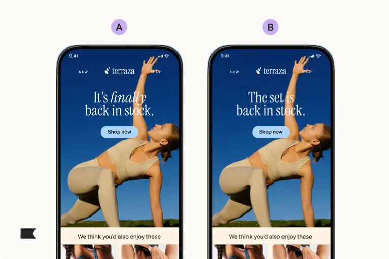
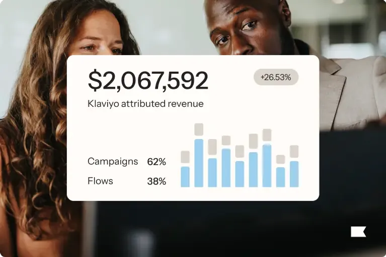
This is what vanity metrics look like. An email campaign drives traffic through the roof and you can see the results clearly in your marketing reporting tool. It’s every business owner’s dream.
Stop. Now, you look at your sales numbers, they’ve barely gone up. Sure, you have a few additional orders, but it’s a drop in the bucket compared to the amount of traffic you’re getting.
Something isn’t right.
That something is your conversion rate.
It’s a trap that many companies fall into—assuming that more traffic equals more sales.
Sales and traffic almost never rise at the same rate.
In other words, a 100 percent increase in traffic rarely equals a 100 percent increase in sales. The result is wasted traffic and money left on the table.
This raises the critical question: How do you convert traffic into sales?
The answer: conversion rate optimization (CRO).
What is ecommerce conversion rate optimization?
CRO is a data-backed system for increasing the percentage of website visitors that convert into customers, or more generally, take any desired action on a webpage.
There are four important elements of conversion rate optimization.
1. CRO is a scientific data-backed technique
CRO is about critically analyzing website data like clicks, traffic sources, the way visitors move through your site, how long they view certain site elements, and much more.
It remove gut instinct, intuition, and guessing from the equation by relying on data. That means you end up making changes only if the data supports them.
2. CRO is a system of improvement not a quick solution
Unfortunately, there’s no single silver bullet that will fix a website’s conversion problems. You won’t reach successful optimization with a single tactic or hack.
Ecommerce conversion rate optimization is a structured system in which brands strategically implement actions based on analysis and testing. You must scrutinize your data, form and test hypotheses, make changes based on the result, and then repeat the process.
With each successive change, the conversion rate increases, leading to a compounding effect.
3. CRO doesn’t require discounts it is a full funnel optimization
True CRO can increase the overall conversion rate regardless of other factors, such as discounts, which tend to artificially inflate the conversion rate.
CRO is not primarily about offering discounts on products. Discounts may bump up conversion rates, but they also decrease margins, which cancels out the increase in conversion rates.
4. CRO focuses on getting each website visitors to take a specific action
The goal of ecommerce conversion rate optimization is to increase the percentage of people who take the desired action on your website.
That desired action could be purchasing products, completing the checkout process, signing up for an email list, or any number of other actions.
This focus on taking desired actions distinguishes CRO from other strategies, such as search engine optimization (SEO) or paid advertising, which focus primarily on getting visitors to a website. CRO emphasizes increasing the number of people who take the desired action once they arrive at a site.
Data to gather for ecommerce CRO
There are four primary data types you can use to optimize conversion rates on your online store.
Use Google analytics for basic data
This includes data from Google Analytics (as the name reflects), such as total traffic numbers, traffic sources, and the ways people navigate through a site.
Analytical data helps paint a picture of the entire customer lifecycle so you can get a better sense of what customers are actually experiencing on your website.
Additionally, CRO analytics also includes data like:
- Top-selling products
- Revenue numbers
- Seasonality information
Getting a holistic sense of your website, not just pure traffic numbers, helps you to better understand what’s important to your customers.
Add in heat maps to your website for user flow information
Heat maps allow you to see where people click on your site, scrolling patterns, and other ways people evaluate a website.
The goal is to determine how visitors engage with different elements of a site.
Once you know how your visitors actually engage with your site content, you can compare that with how you want them to behave (the desired action).
User testing removes the guesswork from data
User testing allows you to observe real individuals using your website and talking out loud about their experience (remember to record their screen and audio).
You can learn exactly when something confuses or frustrates them, which helps you understand what they’re thinking (as opposed to pure analytics data).
When you work on a website day in and day out, everything seems normal, intuitive, and easy to navigate. It’s hard to see through the eyes of visitors, which is why user testing is so critical.
A/B testing is critical for the best case scenario
A/B and multivariate testing enable you to test these hypotheses to determine whether they’re true.
For example, the data may lead you to hypothesize that the navigation menu confuses visitors. You can then test the original menu against a restructured one to determine whether or not that’s true.
If the statistics bear out the hypotheses, you can then make a change to improve the overall conversion rate.
Analytics, heat maps, and user testing allow you to see what is happening on a website, understand patterns, and glean insights on visitor behavior.
From there, you can begin to develop hypotheses on why these things are happening, as well as how to fix problems.
All of this together makes up the optimization process. It’s an iterative process of small incremental changes that add up to a more engaging site, tailored to consumer behavior.
9 tips to boost conversion
Keep in mind, these tips are general best practices, but it’s always best to do your own customer research to know what resonates best with your audience.
1. Use plain language on your website that drives action
Steer clear of confusing, overly technical jargon and create unique, clear, easy-to-understand descriptions for each of your products.
You may love talking about all the detailed specifications of your products, but most people only care about how it will benefit them.
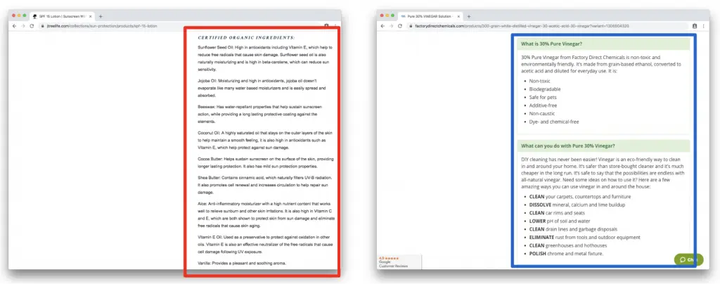
Brand tip-define the jargon
Joshua Tree Skin Care and Factory Direct Chemicals define technical industry terms to help customers understand all the key product benefits, without any of the jargon.
2. Include multiple high-resolution images to attract users
Include multiple high-resolution images, allowing people to inspect the product from numerous angles and perspectives. You want to help potential customers have confidence in your products.
Unlike brick-and-mortar businesses, people can’t physically touch or examine your products. This can create a barrier to purchasing, especially for those who are less likely to purchase online.
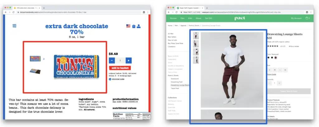
Brand tip-use product imagery that is not one dimensional
Tony’s Chocoloney and Pact both include prominent product imagery that help customers see the product from multiple angles—even from inside the wrapper.
3. Be creative in highlighting lifestyle benefits
Consumers want products that will help them create their ideal lifestyle. One way to improve your conversion rate is to show people using your products. This will help consumers envision themselves using and benefiting from the products.
Additionally, highlight different ways your product will improve people’s quality of life. For example, if you’re selling running shoes, focus on how the shoes will improve running quality rather than on the technical makeup of the insole. One great way to do this is to show your product in use rather than simply on a plain background.
Brand tip-creative use of images to show use cases
While Best Made shows a simple product photo, Pistil shows the product in-use, which conveys more visual information on the product’s size, fit, and function.
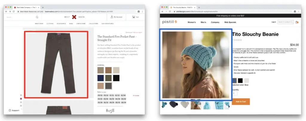
Don’t underestimate Best Made’s simple product image—but consider adding lifestyle images to paint a more comprehensive picture of how a customer could benefit from your product.
4. Include detailed sizing information
Include detailed sizing charts to help people have confidence that their purchase will fit.
If people are worried that something won’t fit and they’ll have to send it back, it’s much more likely that they won’t purchase. After all, returns are a hassle, and potential customers want to minimize them as much as possible.
Brand tip-Add sizing charts with visuals
Outlier and Columbia have excellent sizing charts that include visual elements to help customers quickly understand what each measurement means.
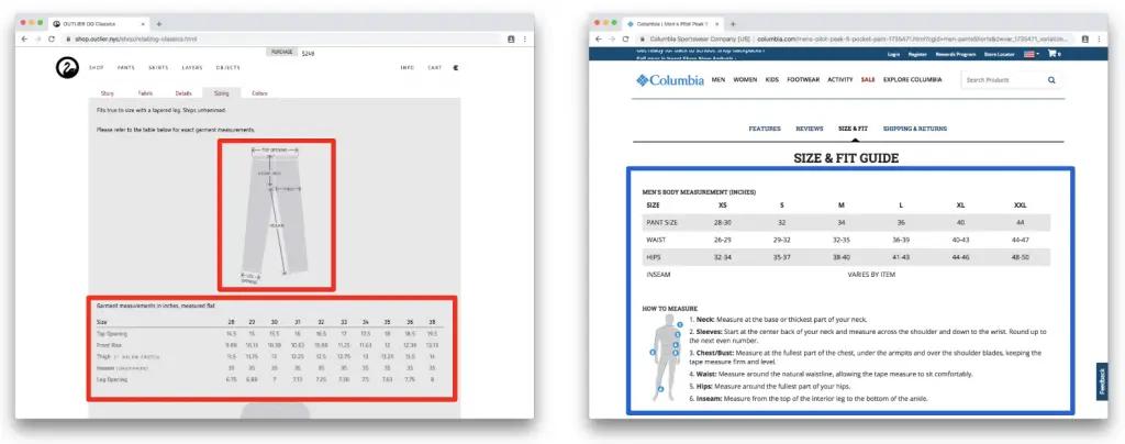
For non-clothing brands, consider what other product size elements are most important to your customers. Furniture brands, for example, will need to include product dimensions to help customers fit the product in their home.
5. Highlight prominently any pricing bonuses
Put your price beside the crossed out manufacturer’s suggested retail price (MSRP) to help the visitor see what a great deal they’re getting.
Everyone likes to feel like they’re getting a good deal, and you can improve conversion rates by highlighting pricing bonuses.
Brand tip-strike out the original price and highlight the deal
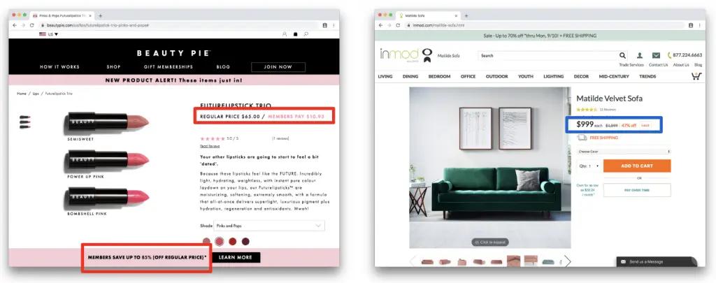
If you’re offering a discount, strike out the discount and show the new price to highlight the deal, like Beauty Pie and Inmod do.
6. Show stock availability and live inventory to create urgency
If stock is running low, you can highlight this fact to create a sense of urgency for the visitor.
If a product is out of stock, make sure to tell the customer before they start the checkout process. Also, give them the option of being notified when the product is back in stock.
Brand tip-update inventory and stock availability through creatives
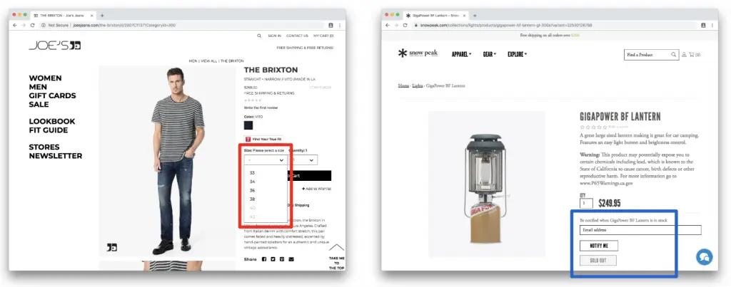
Joe’s Jeans lets customers know when their size is out of stock by greying it out in the dropdown. Snow Peak takes it one step further by giving customers the option to sign up for stock updates.
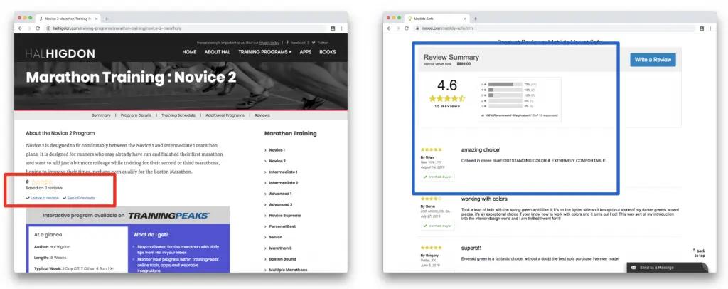
7. Include user reviews to build brand trust
This social authority then builds trust in your brand and products.
There’s a reason Amazon encourages reviews so strongly. Reviews help potential customers understand the benefits of the product, have confidence in the product quality, and know how different people use the product.
Brand tip-add customer reviews on all product pages
Hal Higdon and Inmod both include customer reviews on their product pages to make it easy for people to see what customers liked and disliked about their purchases.
8. Help users compare products through charts
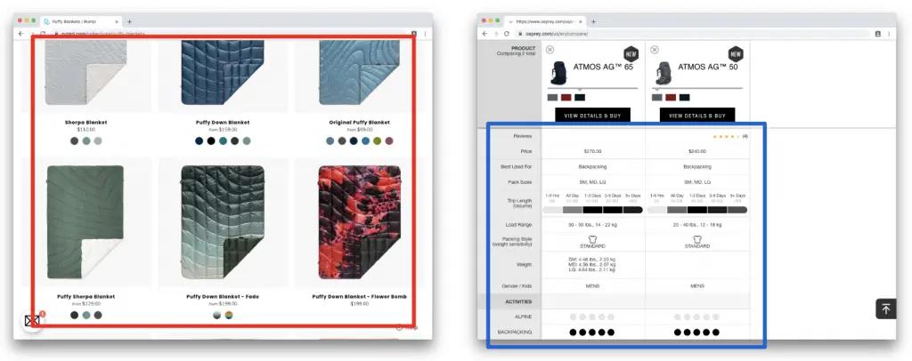
By making it as easy as possible to compare products, you can minimize hesitation and increase conversion rates.
Most shoppers like to compare different products before making a purchase. Having to flip back and forth between product pages makes it much harder to compare and has the potential to lower your conversion rates.
Brand tip-Add thumbnails for different product options
Rumpl shows customers the colors of each of their blankets in small thumbnails to provide at-a-glance comparisons. Osprey takes this principle one step further by giving product comparison guides.
9. Communicate expected shipping and delivery times
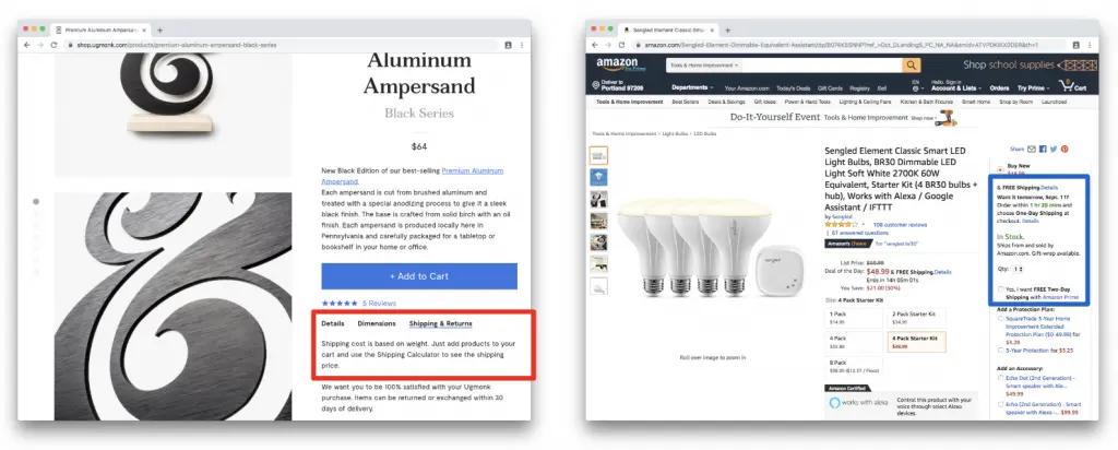
Be crystal clear with your delivery details on your product pages. Tell your customers exactly when something will ship and how long it will take to be delivered.
Delivery is crucial to your customers.
If they can’t figure out how long it will take to ship and be delivered from your website, there’s a good chance they won’t order at all.
Brand tip-Communicate shipping in multiple ways
Amazon gives detailed delivery information. Of course, you don’t need to be Amazon to do this well—Ugmonk is another great example of giving detailed shipping and delivery information.
Traffic can be a vanity number—focus on sales
It’s easy to fall into the traffic trap—the assumption that more traffic automatically means more sales.
Unless your site is optimized for conversions, there’s a good chance that your sales numbers won’t keep pace with your traffic.
If you’re paying for traffic, this means that your return on ad spend will be low, your customer acquisition cost will be high, and your profits will be eroded by marketing costs.
And frankly, it means that you’re leaving a lot of potential sales on the table.
The good news is that conversion rate optimization can take your existing traffic and mine significantly more profit from it. As your conversion rates and revenue increase, you have more money to put back into paid traffic, which then drives up your revenue even more.
It’s a virtuous cycle.
So don’t waste your traffic—optimize your conversion rate to turn more traffic into sales.
Want to nurture customers beyond a product page view?
Try Klaviyo today
