If you were planning to postpone your back-to-school marketing campaign until August, we’ve got news for you.
In 2024, Deloitte’s back-to-school survey estimated that 66% of spending was expected to take place by the end of July, compared to 59% in 2023. Also, 48% of respondents said they plan to shop during Prime Day for back-to-school products—meaning you may want to integrate back-to-school offers into your Prime Day marketing plans.
But how do you know whether your brand is well positioned for a back-to-school campaign? If you sell school supplies or apparel, the answer is obvious. But spending categories also look good for electronics, personal care items, and food.
Whether your brand fits neatly into the back-to-school category or not, these 6 campaign strategies and ideas can help you have your best Q3 yet.
Align your marketing campaigns with relevant holidays and year-round celebrations.
Get your marketing campaign calendar1. Understand the unique value of each channel
Omnichannel marketing is no longer an option for brands. Consumers expect consistent, personalized brand experiences across multiple channels, including social media, email, SMS, mobile push, and WhatsApp.
If you run a back-to-school campaign on social media, for example, your email subscribers will expect access to similar offers in exchange for their personal information.
As you plan your multi-channel back-to-school marketing campaign, keep the following considerations in mind:
Channel | Best for | Strengths | Considerations |
Content-rich campaigns, newsletters, and transactional messages | Scalable, versatile, and highly customizable | Lower open rates in mobile-first regions | |
SMS | Urgent updates, flash sales, and alerts | Wide reach and instant delivery with rich media through MMS and RCS | Consumers in some regions may prefer WhatsApp over SMS |
Conversational marketing, global reach, loyalty programs, and customer support | Rich media, real-time replies, and global trust | Requires opt-in and approved templates | |
Social media | Visual storytelling, user-generated content, teasers, product launches | Wide reach and social proof | Paid social can be expensive and competitive |
Mobile push | Timely notifications, app interactions, flash sales | Immediate interactions and segmented, relevant notifications | Requires an app with rich content and shopping experiences |
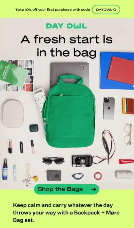
Back-to-school marketing example: Day Owl invests in product photography for email
Subject line: 🎒Back-to-Backpacks!
Source: Klaviyo Showcase
On weekday mornings, parents are racing to pack lunches, braiding hair, signing permission slips, and keeping track of peanut allergies and birthday party invitations. The last thing they need is their kid complaining that they can’t fit everything they need in their backpack.
Day Owl takes advantage of email’s ability to show off great product photography. Thanks to minimal copy and an aerial shot of one of Day Owl’s backpacks along with everything that can fit in it, a busy parent may only need a few seconds to be convinced of the value of the product.
Add in a 10% discount and a clear, well-placed CTA button, and an email like this has the potential to drive a lot of revenue. (The brand also reported a high open rate for this one.)
2. Use AI to write and test subject lines at scale
Subject lines are arguably the most important email copy you’ll generate, because they determine whether someone opens your email and takes action.
Not that long ago, it was a best practice to write two subject lines per email, run a single A/B test on a small portion of your audience segment, then send the rest of your segment the winning variation.
But now, with AI, you can generate many more email subject lines based on recipient behavior, demographics, and past interactions with your brand. You can also use AI to scale up your A/B testing efforts, and run multiple tests for specific elements like urgency, curiosity, humor, emojis, etc.
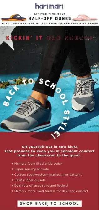
Back-to-school marketing example: Hari Mari piques curiosity with their subject line
Subject line: Back To School Means…
Source: Hari Mari
Footwear brand Hari Mari knows back to school means different things to different people. For some, it’s a great time of year—a time to reconnect with friends, feel productive, and work toward a goal. But for others, it’s not as great—it’s stressful and brings up a lot of uncertainty about the future.
Hari Mari creates a subject line tailor made for this uncertainty. Their subject line asks the reader to finish the sentence, which instantly creates a curiosity gap and encourages opening the email for an answer.
3. Segment your back-to-school audience based on product interest
If you sell multiple products that cater to back-to-school needs, turn to your customer data to find out which subscribers are browsing and buying those products. Offers that reflect real customer behavior win out over blanket offers any time, and audience segmentation is how you create that relevance in your back-to-school marketing initiatives.
To start segmenting, identify which products solve problems related to going back to school. Then, create product-specific segments for:
- Product browsers: people who visited product pages a certain number of times within the last 3 months
- Cart abandoners: people who placed items in an online cart but didn’t complete the purchase
- Discount shoppers: people who bought only after receiving previous offers
- High-value customers: people who spend the most with your brand
Back-to-school marketing tip: Once you’ve segmented your subscriber base and tested your back-to-school offers, use AI-driven product recommendations to increase conversions and average order value (AOV) after the back-to-school season to help meet your Q4 revenue targets.
Back-to-school marketing example: Quay gets specific with blue light glasses offer
Subject line: BACK TO SCHOOL ESSENTIALS
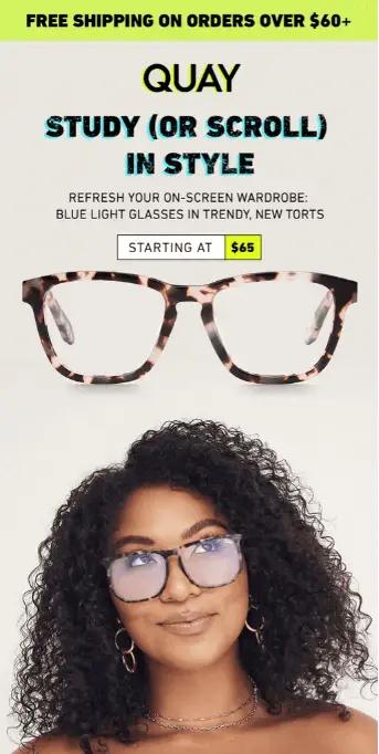
Source: Quay
The return to school means spending a lot more time in front of a computer screen. Quay’s bluelight classes are exactly what students need to avoid hours of eye strain and uncomfortable headaches.
With clean design, high-quality product photography, and bright colors, this back-to-school campaign nails important elements of product segmentation and email design that draw in the reader.
Quay also understands the experience of shopping for glasses—namely, that it can be difficult to find the right pair for your face. The image of the model wearing the glasses makes it easier for people to picture what the frames might look like on their own face.
4. Create custom forms to capture specific back-to-school audience segments
According to Klaviyo’s future of consumer marketing report, 74% of consumers expect personalized brand experiences. B2C marketers are tasked with personalizing thousands or even millions of brand interactions across multiple channels—and gathering zero- and first-party data from their subscribers is how they can create these experiences at scale.
And keep in mind that, for back-to-school and other holiday campaigns, you can also use the data-gathering process to build buzz for different types of offers.
For example, you can build a custom web form that asks highly engaged subscribers whether they identify as a teacher or student, and hint that you have something special coming for them in the following weeks. When you launch your back-to-school campaign, send a custom discount code to each segment to make them feel seen.
Back-to-school marketing example: OSEA Malibu empathizes with teachers
Subject line: A Little Back to School Appreciation
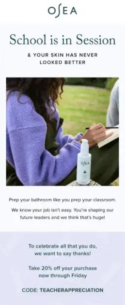
Source: OSEA
Skincare brand OSEA opts for a targeted approach in this back-to-school campaign. Instead of (or perhaps in addition to) focusing on students and their parents—typically the main target audiences for brands this time of year—they tailor their messaging specifically to teachers.
Teachers are the heroes of the back-to-school season—they spend months planning for the upcoming year, and their lessons shape the experiences and minds of younger generations. OSEA hopes teachers will use their products to practice a little self-care, offering them a discount in appreciation for all they do.
5. Set benchmarks for more serious back-to-school campaigns
You’d be surprised how receptive audiences can be when they feel brands are addressing serious, real-life events. But we understand this comes with some risk, which is why we suggest testing serious campaigns on a small subset of your most engaged customers before rolling them out to larger segments.
As a way to de-risk future campaigns with a similar tone, set benchmarks for each channel that can let you know whether you’re on the right track compared to other brands in your industry.
For example, according to the latest Klaviyo benchmarks, the overall average email campaign click rate is 1.29%. But if you’re selling sporting goods, that number increases slightly to 1.54%. If you sell in the sporting goods category and meet or exceed these benchmarks with riskier campaigns, you know it’s safe to roll those campaigns out to a wider audience.
Back-to-school marketing example: She’s Birdie shows up for on-campus safety
Subject line: 🐥10% Off Back to School Sale Starts Today!
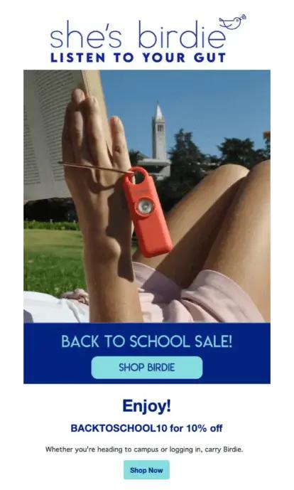
Source: Klaviyo ShowcaseSource: OSEA
According to RAINN, 26.4% of undergraduate women and 6.8% of undergraduate men experience sexual violence on campus.
She’s Birdie is the brand behind a personal safety alarm trusted by over 3 million people—and in this back-to-school email, they remind students their product is an option for protecting themselves in the case of an emergency.
On a basic level, this email demonstrates that She’s Birdie understands the risk the back-to-school season poses for some people, and they show up when their product might be most helpful.
6. Lean on nostalgia to sell to millennial parents
The millennial nostalgia era is here, especially on social media. Erin Miller, for example, has amassed 1.2 million followers on Instagram through nostalgia-based content, and more brands are partnering with creators like Miller to increase brand awareness among millennials.
If you sell products for children, you’re likely targeting parents. Nostalgia may be your way into a back-to-school campaign, especially if you’re unsure whether your products fit neatly into a back-to-school category.
When you run enough nostalgia-based campaigns throughout the year, you may also be surprised to learn how quickly the audience segment fills up. Consider “responsive to nostalgia” as yet another data point to gather for your CRM strategy throughout the year.
Back-to-school marketing example: Candylab uses nostalgic imagery
Subject line: 30% Off Just In Time For Back To School 📚
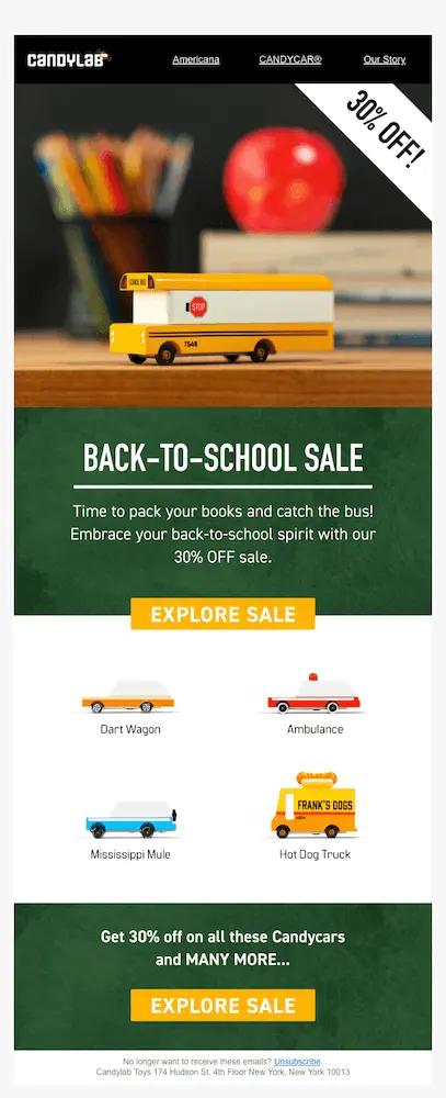
Source: Klaviyo Showcase
September can trigger nostalgia for fall: the leaves are beginning to turn, there’s a nip in the air, and kids are headed back to school. With this email, Candylab Toys evokes this exact feeling.
The toys themselves—retro cars and trucks—invoke Americana, but the brand takes it one step further with art featuring a canister full of pencils, a shiny apple on a desk, and a stack of books.
While today’s children may be tapping at an iPad or reading their schoolwork off a desktop, these images feel quaint and bring about positive memories for parents.
Build personalized brand experiences with Klaviyo B2C CRM
Your back-to-school campaigns are only as effective as the customer data you’re drawing from. When you can send relevant offers from the same platform that updates customer profiles in real time as they interact with your brand, you’re cutting hours of manual work that can’t scale to keep up with consumer expectations.
Klaviyo B2C CRM—the CRM built for B2C—makes it easy for brands to send hyper-personalized campaigns that reflect real customer interactions with your brand.
As a data platform with email and SMS automation, customer service, and analytics under one roof, Klaviyo B2C CRM is making it possible for brands to scale personalization for thousands or even millions of customers.
CTA: Boost sales and engagement all year long with Klaviyo. Sign up
Boost sales and engagement all year long with Klaviyo
Sign up

