A/B testing is a cornerstone of the success of your marketing initiatives, no matter which channels you’re using.
By experimenting with different versions of emails , text messages , and on-site forms —right down to their individual elements—you can identify what resonates most with your audience and drives the best results.
Running A/B tests involves presenting two or more versions of a single variable or element to your audience to see which one leaves a better impression. This process takes the guesswork out of your marketing strategies, improves conversions and engagement, and helps you confidently make data-driven decisions.
To spark your creativity and help you decide on elements you can test, we’ve compiled a list of top A/B testing ideas to try.
1. A/B test email subject lines
The subject line is the first thing someone sees when your email lands in their inbox. Those few words can make a difference between an email open and a quick scroll past or delete—and if your email doesn’t get opened, it can’t drive clicks or orders.
That means the success of your email efforts depends, first, on your subject line.
With that in mind, crafting subject lines that resonate with your audience is worth a little extra time. Even if you’re sure you’ve nailed it, A/B testing can confirm what truly works.
Here are some ideas you could try:
- Degree of personalization: Mention a person’s name in the subject line or reference a specific product they browsed but didn’t order. Compare these with more general subject lines to see which approach lands better.
- Length: Experiment with shorter and longer subject lines to find the sweet spot for your audience. According to Klaviyo research , subject lines around 7 words long can achieve open rates of nearly 30%, so use this as a guideline for your tests.
- Level of urgency: Try subject lines that create a sense of urgency with phrases like “last chance” or “final call,” and compare them with those that take a more relaxed tone. This will help you discover which strategy drives more engagement.
Modern workwear brand Cargo Crew , for example, ran 3–4 A/B tests on their post-purchase flow, looking at both email subject lines and send times. Since launch, the flow’s revenue per recipient has grown 3.5x .
A/B testing ideas pro tip: Klaviyo AI can help you develop subject lines at scale. Test AI-generated subject lines against one another to determine which ones yield better results at a higher volume. Klaviyo’s smart A/B testing also makes it easy to see which email subject lines perform the best, then automatically serves up the winner to the majority of your recipients for any given campaign.
2. A/B test calls to action (CTAs)
CTA buttons in emails and on forms are key to driving action, whether it’s making a purchase or signing up for a newsletter. With text messages, you’re dealing with links rather than buttons, so it’s the copy surrounding the link rather than the action-packed CTA itself that matters.
CTAs are sometimes overlooked, but they can have a major impact on your audience and the success of your emails or forms. A well-phrased, well-placed CTA is what guides your audience to the next step in the buying journey.
While you might have a strong grasp on the basics regarding CTA language or placement, like keeping them short and sweet and placing them in a prominent spot, A/B testing allows you to explore different CTA versions and see what grabs your audience’s attention most effectively.
Here are a few ideas for A/B testing CTAs:
- Design: In emails and forms, experiment with different colors, shapes, and sizes for your CTA buttons, or compare CTA buttons to simple text-based hyperlinks. Be sure to keep your CTA design on-brand.
- Copy: Try out different phrases and action verbs. Keep all CTA copy short and clear across channels.
- Placement: Play around with CTA placement. Put the button or link in the center, side, or bottom of the form, or place it in the middle of the email or at the top. (Note that links typically come at the end of promotional texts, but you could test to see if moving the link up makes more sense in certain contexts.)
- Number of CTAs: Create different email variations with either a single CTA button or multiple buttons to see which configuration performs better. (Note that it’s best practice to only include one CTA in a text message .)
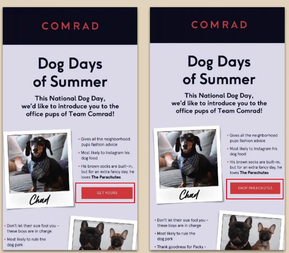
In this example, notice how all the elements of the email stay the same, except the CTA copy. Testing only one element at a time is an A/B testing best practice that helps you avoid confusion and get accurate results.
3. A/B test voice and tone
You can relay the same information in many different ways, depending on your goals and target audience.
In a welcome email, for example, it’s important for your copy voice and tone to reflect your brand identity, whether it’s casual, friendly, playful, witty, or formal. In an order confirmation email, on the other hand, expressing your brand voice is less important than delivering information.
But copy voice and tone can be a highly subjective area. Let’s say your brand’s voice and tone is “casual and playful,” for example—that could mean a lot of things to a lot of different people, and not every version of it will resonate with your audience.
That’s where A/B testing comes in. Experimenting with your copy voice and tone across emails, SMS, and forms can give you more information about how your audience views your brand and what makes them feel connected.
When ethical jewelry brand Dana Rebecca Designs wanted to refine their messaging to better build long-term relationships with individual customers, they turned to A/B testing everything from subject lines to voice and tone to uncover what performed best with different types of customers, such as self-purchasers vs. gift-givers and men vs. women.
This testing strategy is part of why 37% of Dana Rebecca Designs’ revenue from August 2021 to August 2022 was attributable to Klaviyo.
4. A/B test email and form design
A well-designed email or form can boost conversions and overall performance. But there’s no universal solution that works every time.
That’s why testing different design elements is crucial. You want to make sure your emails and forms are both visually appealing and functional—for example, placing links too far down in an email might reduce click rates, while a cluttered layout can overwhelm the reader.
To find out which design elements work best for your audience, test individual elements, such as:
- Layout: Does a one-column design perform better than a two-column one for promotional emails? How about placing an image on the left vs. the right for a sign-up form?
- Color schemes: Do brighter colors capture attention, or do neutral tones encourage more interaction?
- Copy- vs. image-heavy: Text-heavy or even plain-text emails are ideal for telling a story about your business, especially when formatted as a letter from the founder or CEO. But beautiful visuals might perform better in an email announcing a new product line.
- Different media: On that note, not all visuals are created equal. Try testing different hero images and product shots, gifs vs. static images, UGC vs. professional photography, and more.
5. A/B test SMS vs. MMS
Depending on how you’re using images and emojis in your texts, as well as how your SMS marketing platform handles MMS pricing (1 MMS on Klaviyo gives you 1,600 characters with or without emojis, for example), MMS could end up being either more or less cost-effective than SMS.
That means you should always think hard about whether MMS is adding value. Product-specific images, for example, may work well in collection launches or abandonment flows. But generic gifs or “30% off” banners may not be as effective at moving the needle.
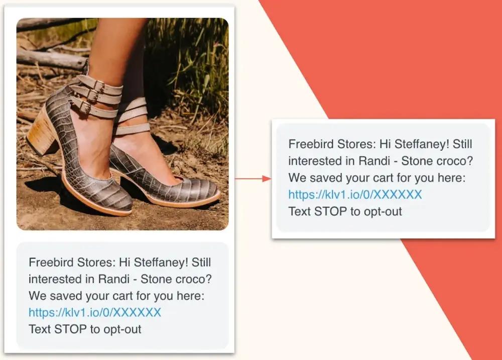
Take it from Fast Growing Trees , an online nursery. They used to send 4–5 MMS campaigns per week to their 180-day engaged segment, with creative mirroring email campaigns. But costs were escalating.
When the team tested SMS vs. MMS campaigns, the results surprised them: SMS, the less expensive option, drove the best engagement by far—about 10x the expected click rate on some sends, for a third of the price. Updating their SMS strategy accordingly contributed to a 231.7% QoQ growth in SMS click rates .
6. A/B test email and SMS content
“Content” is a broad term that may encompass several of the elements we’ve already discussed in this article, such as copy voice and tone, CTAs, and design, layout, and visuals. But it also refers to the thematic “what” of your marketing message.
Is it educational? Promotional? Brand storytelling -driven? A blend of all or some of the above? And in what specific contexts do different types and lengths of content work better or worse? Should your abandoned cart email reference only the exact product the customer left behind, or should it also include personalized recommendations related to that product? Should your post-purchase email simply thank the customer for their order, or should it include a recipe or style guide with tips on how the customer can put their new product to its best use?
A/B testing allows you to experiment with different types of email and SMS content to see which types resonate most with your audience, when.
Huda Beauty , for example, updated their content strategy after A/B testing to evaluate how performance shifted when they showed vs. hid different types of content. Based on the test results, they started sending longer emails, weaving in more education, user-generated content, and storytelling about the brand’s well-known founder.
The shift helped Huda Beauty drive more than 2x growth in Klaviyo-attributed revenue YoY . “We’re making sure that customers are getting the information that they need from us—not just ‘Buy! Buy! Buy!’” says Phuong Ngo, customer relations and loyalty manager at Huda Beauty.
7. A/B test form complexity
While some brands find that short, simple forms are most successful , a Klaviyo data analysis revealed a slight correlation between form submission rate and the number of “components” on the sign-up form. In other words, the more “complicated” the form, the better it performs.
Ultimately, asking for information beyond an email address and phone number may not only increase your form submission rates, but also provide you with the kind of customer data that proves invaluable in personalizing your marketing messages down the road.
Or, it may not. But you won’t know unless you test.
Try testing simpler, more straightforward sign-up forms vs. more complex ones, with fields asking for data points like:
- Birthdays
- What products they’re interested in
- Why they’re shopping or who they’re shopping for
- How often they plan to purchase your products
- What kinds of marketing messages they want to receive, and how frequently
When baby boutique Caden Lane , for example, A/B tested 30 versions of their website pop-up form, they found that conversions soared when they asked visitors for more context—such as whether they were shopping for a baby on the way, a newborn, or a child 5 or older.
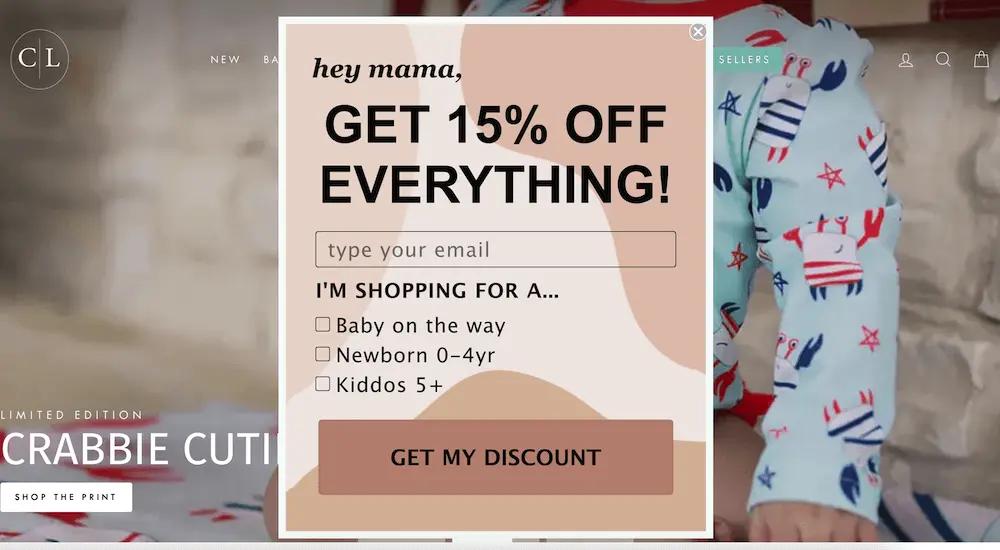
People subscribe to Caden Lane’s marketing expecting personalization, and they get it from day one. The tests helped contribute to 157.3% YoY growth in Klaviyo-attributed revenue .
8. A/B test email and SMS send times
If you send them at the wrong time, even the best emails and texts won’t hit their mark—and your performance metrics will fall short of expectations.
Send times are critical to the success of your email and SMS campaigns. But here’s the challenge: there’s no one-size-fits-all solution. Night owls and early birds, for instance, have drastically different habits. Age, profession, and time zone also play major roles in determining the best time to send.
So, how do you find the right time? Start by segmenting your audience based on shared characteristics like demographics, purchase behavior, or activity level. Then, conduct A/B tests to experiment with different send times and days for both emails and SMS messages.
For example, A/B test sending the same text at noon vs. 2 p.m. on a Tuesday to see which performs better. Or, try sending the same email at 10 a.m. on Wednesday vs. 10 a.m. on Thursday to get a better feel for the best day to send emails .
Timing optimizations like this helped beauty bran Patrick Ta unlock outstanding BFCM performance, growing their Klaviyo-attributed revenue 8x YoY.
“We know how competitive it is during Black Friday,” says Heidi Lim , Patrick Ta’s VP of ecommerce. “We combined past A/B test learnings on optimal send times with a strategic approach to content and messaging cadence to keep engagement high.”
A/B testing ideas pro tip: Your marketing platform should make it easy for you to A/B test email timing by splitting your audience into groups and sending emails at different times. If your list consists of at least 12,000 subscribers, Klaviyo’s Smart Send Time can use your data to determine the optimal local time to send emails to customers.
9. A/B test form display timing
Similarly, optimizing the display timing of your web forms can significantly improve engagement and sign-up rates. Display a form too early, and it may interrupt the browsing experience; show it too late, and you risk losing the visitor.
Different pop-up forms will appeal to different visitors based on where they are in the customer journey. Is it better to display your form immediately when someone lands on your site, or wait until they’ve scrolled a certain percentage of the page or lingered for at least 20 seconds?
A/B testing ideas pro tip: In Klaviyo, you can use AI to run a series of experiments that optimizes your form’s display settings —without any manual work on your end. In this test, AI generates different variations of display timing for your form, then runs the test in phases until a winner emerges with the highest-converting display time.
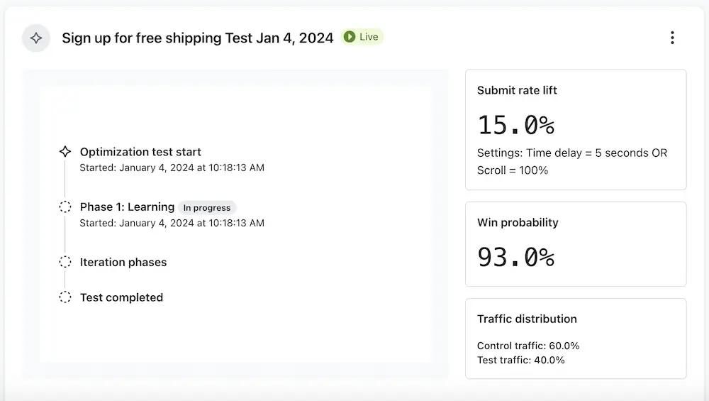
When natural skincare brand Tata Harper used this feature to test 20 placement and timing variations across their desktop and mobile sign-up forms for both email and SMS, submissions jumped 65%+ in just 30 days.
“Our AI testing experience definitely made me excited to play with the other new Klaviyo AI features, because it was so hands-off and delivered immediate results,” says Alexandra Barlowe, the brand’s DTC email and SMS marketing director.
10. A/B test incentives
Shoppers are always looking for a good deal. If your offer isn’t valuable enough, they may hesitate to sign up for your email or SMS list or click on an email or text message. On the other hand, if your offer is too good to be true, your brand’s value perception may suffer.
Your job is to make your offer enticing enough to create interest and ultimately drive conversions—without betraying your reputation or your bottom line.
That’s a delicate balance, and A/B testing can help you strike it. Here are a few ideas for testing different types of incentives across forms, email, and SMS:
- Percentage vs. dollar amount off
- Discount vs. free gift with purchase
- Discount vs. chance to win a contest or giveaway
- Discount vs. BOGO deal
- Free shipping vs. free content downloads
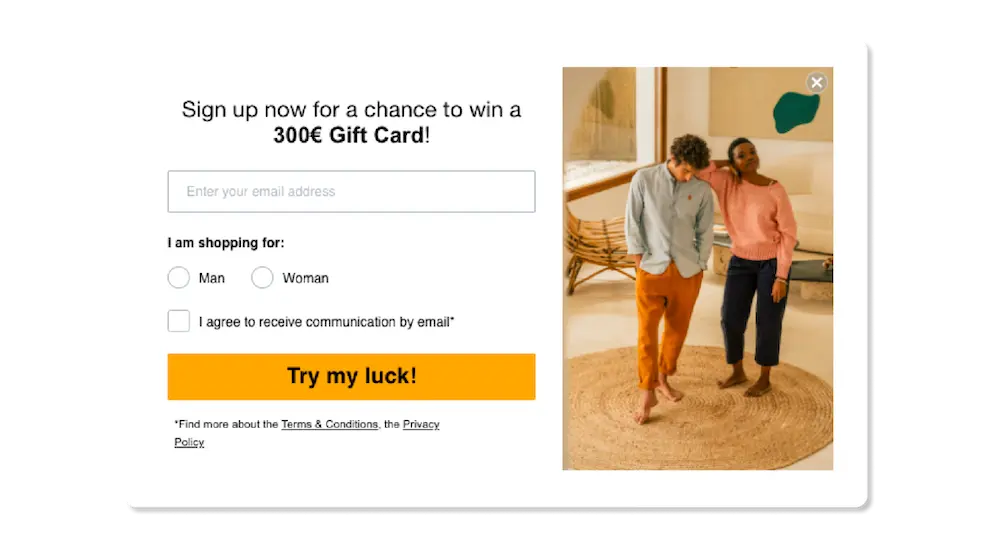
Sustainable clothing brand Brava Fabrics , for example, used to offer a universal 10% discount on their sign-up form. But when they tested the discount against the chance to win a €300 gift card for subscribing, the results were surprising: the two offers performed identically .
They even raised the stakes from €300 to €1,000—but increasing the potential prize money had no impact on form submission rates. Replacing the universal discount with a single prize for a single customer helped Brava Fabrics protect their marketing budget.
11. A/B test email vs. SMS sequence in flows
In flows that involve sending multiple messages to subscribers across channels , it can be difficult to determine which should come first—the email or the text.
If you’re cost-conscious, you might start with email to see if someone will engage with the lower-cost channel first, then follow up with a text if they don’t. That’s an especially wise strategy for a lower-intent flow, like browse abandonment .
But for higher-intent flows like abandoned cart or back in stock , sending a text at the top of the flow can help you get in front of the shopper while your brand is already top of mind.
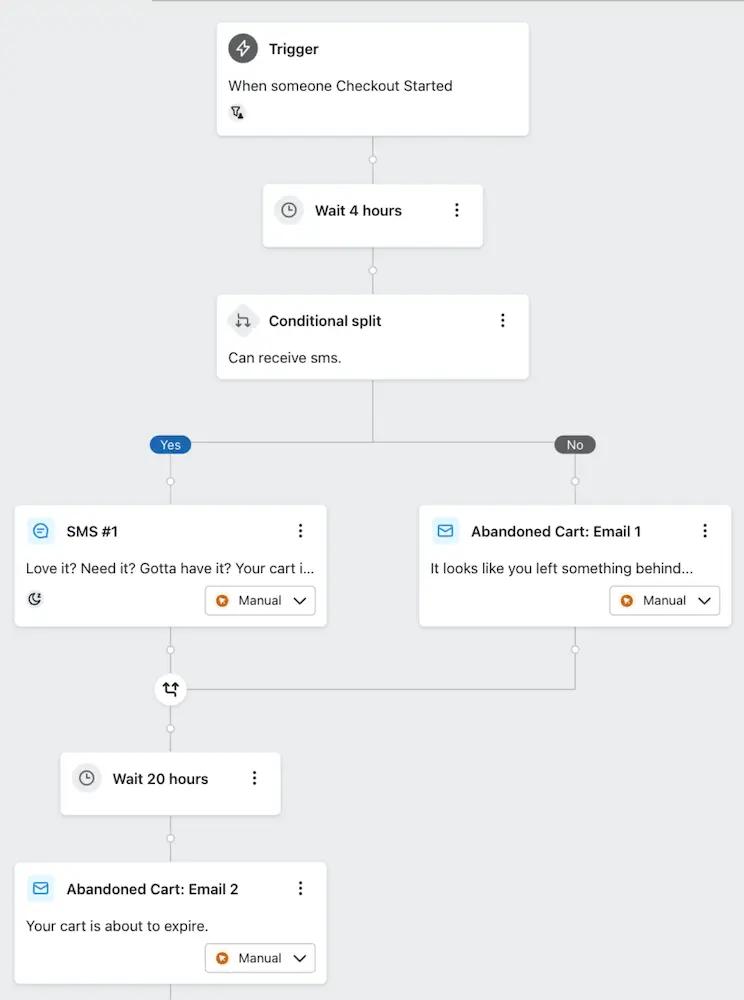
When your email and SMS marketing live in the same platform, you can A/B test the sequence of your messages within a flow to find out which order performs best with your subscribers.
A/B testing ideas pro tip: Never try to test SMS against email. The channels are too different to yield a conclusive test—remember, A/B testing is only valid when you test one element at a time.
12. A/B test for each individual, rather than the majority
A/B testing is valuable because it teaches you what type of content resonates with the majority of your audience. But what about the section of your audience that actually preferred the losing variation?
With Klaviyo’s personalized campaigns AI , you can send campaigns that are likely to resonate with individuals—not just majorities.
This advanced A/B test identifies patterns in recipients’ profiles to determine which campaign variation is likely to convert. After selecting your winning metric and testing a single variable, AI sends out the best version for each individual recipient automatically.
AI-powered features like these aren’t just time savers—they’re revenue drivers. They optimize your workflow and accelerate campaign creation, so you can focus on what matters most.
Learn more about how Klaviyo AI can optimize your workflow and accelerate content creation so you can focus on what matters most—especially during peak times like BFCM .
Related content
- 12 forms, SMS, and email A/B testing best practices for ecommerce brands
- 5 actionable ways to make smart A/B testing work for you
- 4 creative list growth use cases that leverage A/B testing to build an audience, fast
Ready to become an A/B testing virtuoso with Klaviyo?
Sign up


